Wednesday, 28 February 2018

OUGD503 - Responsive - MBTW - Potential Imagery to Include


I have done some quick research into some visual elements that could be included within the design.


Tree/Forest imagery & silhouettes


Logotypes


Tree rings within the trunks

OUGD503 - Responsive - MBTW - Typography Research


A handwritten/brush script style is something that I think could work really well for the typography within the logo.

This sort of typography is calm, soothing and has links to a vintage/traditional style which would be ideal to represent the business.


I downloaded a few different typefaces that I thought may be suitable for the project;


1 - Good Vibes
2 - Shania & Heinz
3 - Chasing Embers
4 - Gloss and Bloom
5 - Beyond The Mountains
6 - Harvest Barn

I really like all these typefaces and can really see the potential of them working well within the context of the logo. I am going to do some playing around to see which would be the most suitable.

OUGD503 - Responsive - MBTW - Colour Schemes


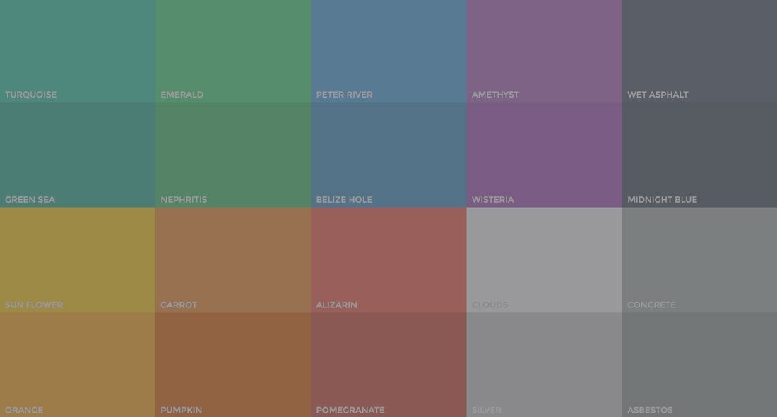
I have started looking at some potential colour palettes for the logo, based around muted and earthy tones to match the nature of the business.


Image result for muted tones  Image result for muted tonesImage result for muted tonesImage result for muted tones

Although it seems cliché, I do think that a brown/green palette would be the best bet for this project as it sticks to the traditional roots and clearly communicates the business effectively.


OUGD503 - Responsive - MBTW - Moodboarding


I have gathered a few images of different things that I want to be influenced by for the project.


Quotes/Landscapes


Woods/trees/natural materials


Mister Charlesworth - natural, muted tones and shapes


Natural Interiors - woods, geometric shapes etc


OUGD503 - Responsive - MBTW - Target Market


I have noted down a few pointers based around the target market for the business;

- Age - older, perhaps somewhere between 30-40+

- Interests - traditional craft, vintage items, natural materials, wildlife/nature?

- Willing to pay a little extra for handcrafted, detailed items


These factors will influence my design process and by looking at these I will be able to appeal to the correct audience in an effective way.

OUGD503 - Responsive - MBTW - Initial Thoughts


MadeByTheWoods is a small, independent business specialising in woodcraft. They are looking for an artist to design logo that is recognisable and highlights the ethos of the brand. The logo will be used online (website, social media, etc.) and for print (business cards, promotional materials, invoices, etc.)

Consider:
 • Origins – woodland/reclaimed wood/recycling
 • Muted, natural colours
 • Include the name: MadeByTheWoods


I have chosen to do this brief as another small quick one over a couple of days.
 I decided to do some quick research into the business and came across their Etsy page.

I could see that the items they made were very neutral and very traditional.


I also ended up on their Facebook page, which didn't have much to show BUT I was able to see the creators themselves, the main man being Raymond Woods.


I was shocked to see that the business was formed of just two people, a couple, the Woods. This immediately changed my viewpoint on the whole project, as I thought the owners may be young/trendy etc. This means that rather than looking purely at modern and contemporary approaches, I may go for something slightly more traditional, which I feel would be better suited to the client (the owners).


Tuesday, 27 February 2018

OUGD503 - Responsive - Animal Farm - Final Designs


Book net spread.


Front Cover.


Back Cover.

OUGD503 - Responsive - Animal Farm - Putting in Body Copy


I decided to use the same typeface for the rest of the text on the book. For the spine I simply flipped the same text vertical so that it read from bottom to top.

I chose to have the author name at the very top of the spine as many people search for books via author, and I thought having the author at the top would allow for best visibility and make it easier to pick out on a shelf.

\   

I chose to have the quote from the book separate from the rest of the copy to make it clearly stand out as an actual extract from the book.


I chose to make this bold, with the intention of having the rest of the text in the lighter weight.


At first I was planning on having the text a long, vertical column adjacent to the collage.


However, I felt this wasn't working well visually so I decided to 'wrap' the text around the image, having the top half above the image and the rest down the side in an adjoining text box.


Overall view.


As a little extra adjustment, I chose to remove the capital letters from the quote so it matched up visually with the title. The reason for no capital letters was purely for aesthetic purposes, and aimed to add to the modern and contemporary vibe.

OUGD503 - Respsonsive - Animal Farm - Picking a Typeface

 I knew that I wanted to go for a clean, simple sans-serif typeface for the cover to match the contemporary and modern aesthetic.

I also felt a sans-serif typeface would reflect the harsh brutal nature of the book itself.

I tried out a few different possibilities and ended up settling with Arial as I felt this best represented the aesthetic I was after.


I wanted to go for a contrast in weight between the book title and author name. I felt that the book title should come above the author name on the cover so I chose to have this in a bold weight, with a lighter weight for the author name underneath.


I felt that the weight difference between the two was too subtle, so I used the outline tool to bulk up the title a bit more to show that extra bit of contrast.


I also noticed that the kerning needed to be adjusted because a few of the letters had become too close and did not look right visually.


I played around with the layout and size of the text for the best fit


And came to the conclusion that I would have the text rather small in the top left hand corner of the cover, so that the most attention was on the collage rather than the typography.

OUGD503 - Responsive - Animal Farm - Application


I wanted to remove the white area from around the animals so that I was able to freely place it onto the book cover without worrying about it covering up other elements.

The first thing I tried was the select and mask tool but I found that this was taking chunks of the image away and was too hard to control.


Secondly I tried the magnetic lasso tool which worked a lot better at 'cutting out' the imagery from the background.


I copied and pasted this onto a new layer and removed the original layer to get rid of the background.


Finally I cropped the image to make it as small as possible.


After downloading the template, I placed it into an Illustrator file with the correct dimensions.


The first thing I did was use the ruler tool to create some guides - this allowed me to see exactly where the book would be 'cut' and helped me distinguish between the covers/spine etc.


I started experimenting with how I could place the collage onto the cover - I wasn't sure whether it would look best spanning across the entire spread, or kept just on the front cover.


I felt the whole thing looked quite disjointed when the image was just placed on the front


So I settled for the collage spanning across the front, spine and back cover, but with the majority of the image based on the front.


OUGD503 - Responsive - Animal Farm - Creating Collage


After printing off a few different images, I started playing around with different formats and positions I could have the animals in.

I took a very literal approach to this design and used the animals along with a traditional yellow tractor in order to represent the book title.

 I chose to place the sheep's head on the horses body in order to create a fun and 'wacky' feel, very similar to the book and author itself.


Once I was happy with the final design, I scanned it in to the computer in order to work with it on the cover.

After scanning the images in, I noticed that they had become slightly blurred/lined, which is an effect I was really happy with as it gave a vintage/worn element to the collage.


OUGD503 - Responsive - Animal Farm - Collecting Images


Due to the short nature of this brief, I have decided the best way to collate the images would be to gather them off the internet for ease and quickness.


I have decided to include 5 different farm animals for the cover. After some brief research into the most common farm animals I have come to a decision;

- Horse
- Sheep
- Hen/Chicken
- Cow
- Pig

I have also thought about including a tractor to break up the animals with something a bit more object-based.