In order to get a better idea of the current market, I undertook some brief research into existing pizza boxes. Due to the short nature of this brief, I was limited to the amount of time I could spend on the research stage.
I collected some images that I felt were interesting/relevant:
Dominoes Pizza;

*2 colour print, simple yet effective. Highly typography based, a few basic illustrations. Fun quirky retro feel, sketchy style.
Old Brick Pizza Co;

*simplistic, typography based. One single colour used - works well against unbleached cardboard background. Rustic and authentic feel.
Pizza Express;
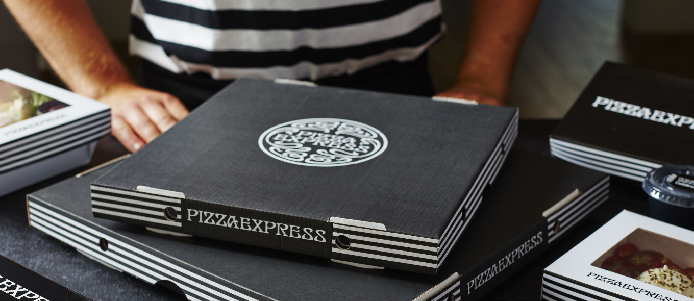
*black and white - monotone branding. Mainly black box - unique, contemporary, stylish. Simple logo on front, stripes down side.
Pizza Hut;
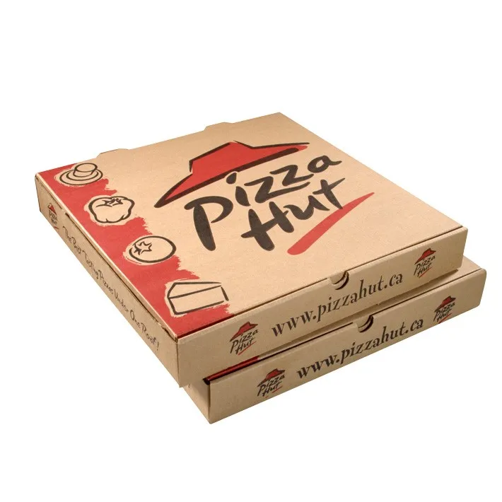
*red and black on unbleached card, authentic feel. Simple logo with vector icons down side. Basic yet bold and effective.
Make & Take;
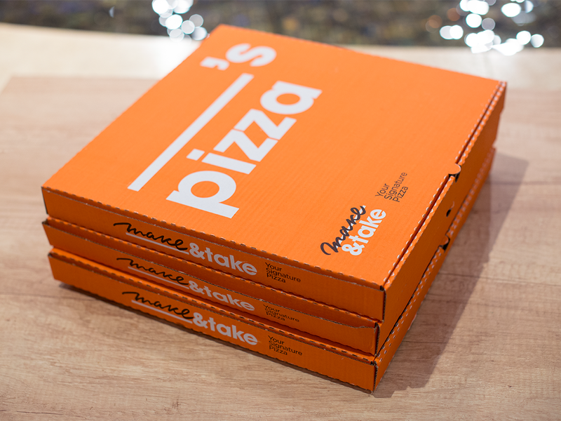
*simple yet effective concept - name left blank so pizza personal for anyone. Sans serif typeface quirky and modern. Bright orange unique and effective with white text. Moves away from traditional pizza box styles.
Papa Johnny;

*take on Papa Johns pizza but for cupcakes. Traditional red and green used on unbleached card. Quirky character central to design. Italian feel with bold sans serif typeface. Fair bit of text used.
Oven Fresh;

*quite a traditional style - red and green used on white box. Striking and eye catching. Vector outline of chef - adds handmade feel. Checkerboard recognisable.
No comments:
Post a Comment