Monday, 29 April 2019

OUGD603 - Pizza Box Rebrand - Before and After


Before and after of final pizza box;


There is clear difference when you view the two boxes side by side. The previous design was dated, overcomplicated and messy. The rebrand is fresh, striking and modern.

The red and green colours are carried over, along with the addition of the mustard yellow shade (which represents the pizza dough itself).

The fussy script style typeface is replaced with a strong and clean sans serif typeface, which clearly communicates a bold message 'this is hot fresh pizza.'.

The illustrated images are removed, and instead replaced by some basic illustrated lines that create a fun and quirky feel without being too much.

The unbleached box style carries connotations of authenticity and add an organic and rustic feel.


OUGD603 - Pizza Box Rebrand - Final Design and Mockup


Final pizza box design;


*modern
*simple
*striking
*memorable
*authentic

As a mockup; 
I was really happy with how the final design looked as a mockup. I added a few extra details, such as taking the yellow from the logo and colouring the lip/inside of the box the same. 


OUGD603 - Pizza Box Rebrand - Finalizing Designs


I came to the decision that the white text worked best against an unbleached card background, with the illustrations in a different colour for each word.

I started to finalise the format, playing around with layout to see what worked and what didn't.

I tried adding circles around the text but felt this didn't look right with the illustrated style. I tried a more hand-drawn style, but it was too much.

I also experimented with a drop shadow on the text, but this didn't look as fresh and modern as the version without.


After some peer feedback, I eventually settled on a final design;


The logotype was placed quite large in the center of the box. This made the text the main focus, whilst remaining modern and simplistic.


Underneath, I added a phone number and 'caution: hot!' in the same typeface. I didn't want these piece of text to take away from the main logo, so kept them relatively small.

OUGD603 - Pizza Box Rebrand - Design Development


Whilst I was quite happy with the typeface, Bebas, I felt that the design was lacking something a little extra. I wanted it to look contemporary yet still have a fun and quirky edge.

I started playing about with the pen tool, and ways I could add little illustrations to the text.

I tried to think of things that were relevant for each word, for example;
-hot = steam lines
-fresh = zingy, fresh burst lines
-pizza = crust and end of slice, or two lines to represent thickness of pizza base


I then started looking at ways to add colour to this, as the client had requested that I keep both the red and green shades. I swatched these from an image on the existing packaging.


Trying different variations;


Once I pretty much happy with the logotype, I then started applying it to a square box shape to see how it would function on the actual packaging. I experimented with a variety of colours for the actual box;


OUGD603 - Pizza Box Rebrand - Initial Ideas


To kickstart my initial design process, I started looking at different typefaces that could work for the 'hot fresh pizza' name. This is actually the company name, and I wanted this to be clear, whilst also looking like a way to 'describe' the food.

I tried a variety of different styles, from sketchy and handwritten to more futuristic ones. The handwritten styles looked too messy, whilst the futuristic styles lost that authentic, rustic feel that pizza branding usually has.


One particular typeface I felt was working really well - Bebas. The sans serif style was modern and contemporary, and looked particularly good capitalised.

I liked how the three words looked as one - 'hotfreshpizza.'. It had a modern yet quirky element and very to the point - this is hot fresh pizza, and that is that.

I started playing around with how this could potentially look on an actual pizza box, layout-wise.


I quite liked how it was functioning, especially as three words on top of each other - again it implied that bold statement that this is 'HOT. FRESH. PIZZA'.


OUGD603 - Pizza Box Rebrand - Market Research


In order to get a better idea of the current market, I undertook some brief research into existing pizza boxes.  Due to the short nature of this brief, I was limited to the amount of time I could spend on the research stage.

I collected some images that I felt were interesting/relevant:


Dominoes Pizza;
Related image
*2 colour print, simple yet effective. Highly typography based, a few basic illustrations. Fun quirky retro feel, sketchy style.


Old Brick Pizza Co;
Image result for old brick pizza co
*simplistic, typography based. One single colour used - works well against unbleached cardboard background. Rustic and authentic feel.


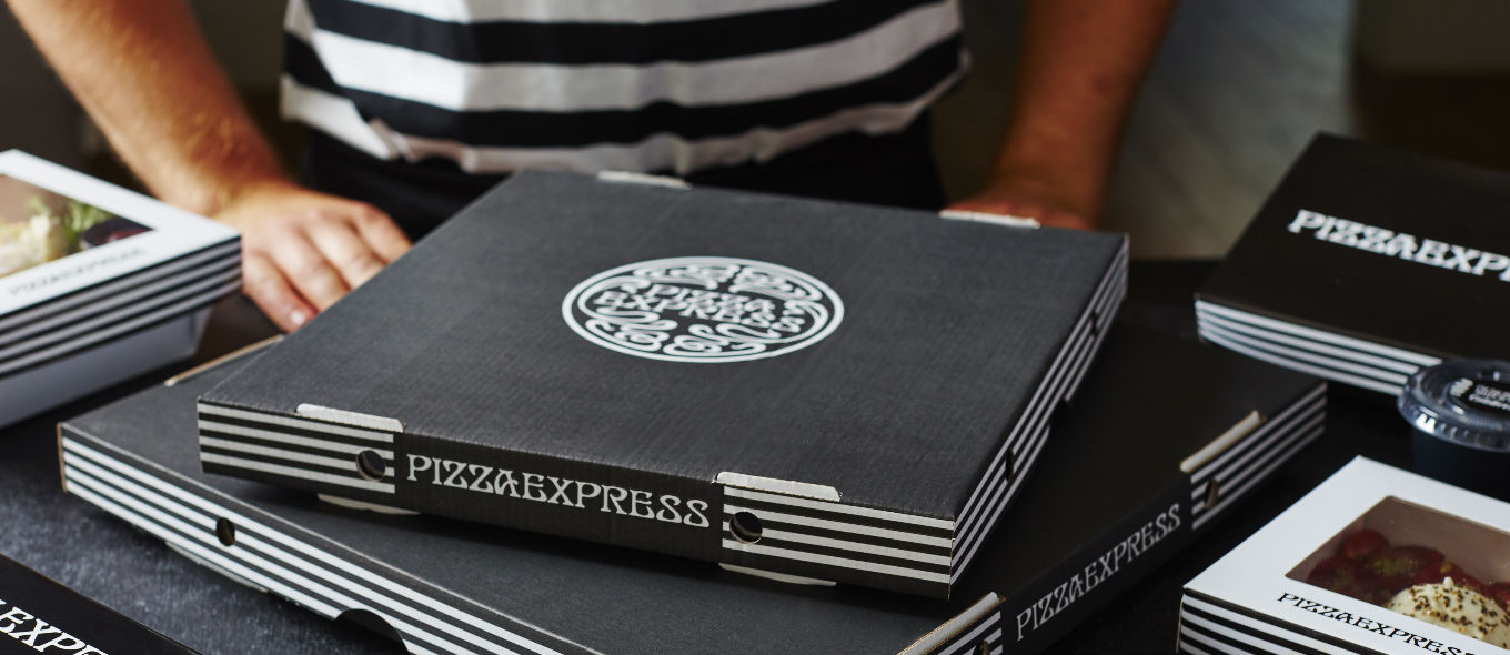
Pizza Express;
Image result for pizza express box
*black and white - monotone branding. Mainly black box - unique, contemporary, stylish. Simple logo on front, stripes down side.


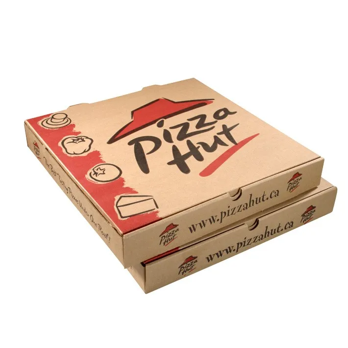
Pizza Hut;
Image result for pizza box
*red and black on unbleached card, authentic feel. Simple logo with vector icons down side. Basic yet bold and effective.


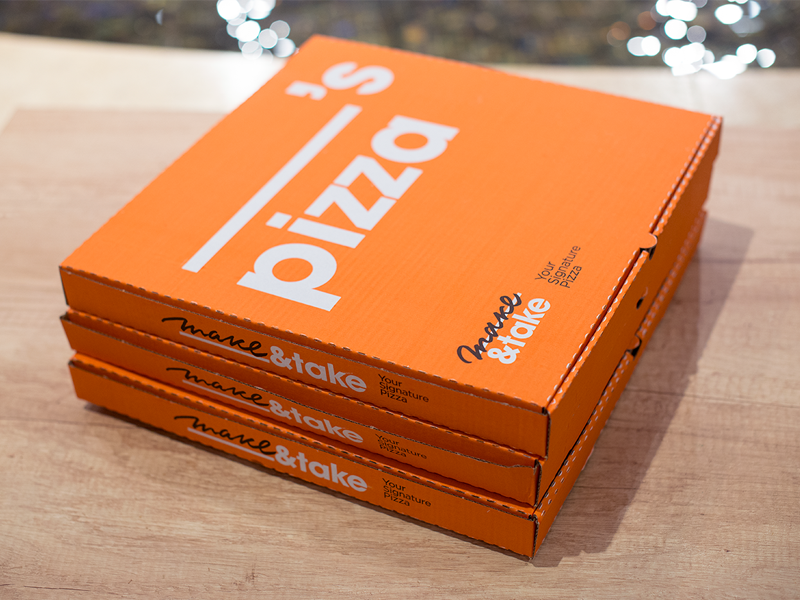
Make & Take;
Image result for pizza box
*simple yet effective concept - name left blank so pizza personal for anyone. Sans serif typeface quirky and modern. Bright orange unique and effective with white text. Moves away from traditional pizza box styles.


Papa Johnny;
Johnny Cupcakes x Papa John’s Limited Edition “Papa Johnny” T-Shirt Custom Pizza Box Packaging
*take on Papa Johns pizza but for cupcakes. Traditional red and green used on unbleached card. Quirky character central to design. Italian feel with bold sans serif typeface. Fair bit of text used.


Oven Fresh;
Related image
*quite a traditional style - red and green used on white box. Striking and eye catching. Vector outline of chef - adds handmade feel. Checkerboard recognisable. 


Thursday, 4 April 2019

OUGD603 - Baby Brand Collab - App Phone Mockups


OUGD603 - Baby Brand Collab - Final App Design


OUGD603 - Baby Brand Collab - Putting the App Together


Following the failure of the lookbook due to image quality issues, we decided that we would produce an online shopping app as well to further display our designs. Abigail left this up to me as she had no idea where to start with app design!

Putting the app together was a fairly simple process as we already had everything in place - imagery, typefaces, etc.

I had used Adobe XD before and found it quite easy to piece together.

I created the app pages within Illustrator,  using imagery and type that we had already created;


Front page of app/loading page;

*main hero image with brand name and logo, and loading circle in corner


Home page;


*home page of app, links to different elements e.g search, basket, featured products etc


Lift-Off Collection page;


*showing products from lift-off collection


Product page 1;
 
*planet romper product page/s


Product page 2;
 
*starlight leggings product page/s

Purchase/place order page;


Once I had created all the pages within Illustrator, I simply saved them as a JPEG and placed them into Adobe XD.


I then used the prototype tools to put together the app, adding the links and click buttons to make the app fully functioning;

Wednesday, 3 April 2019

OUGD603 - Baby Brand Collab - Booklet Mockup

After we had the posters sorted, we felt it would be really fitting to create a lookbook for the clothing collection.

HOWEVER... :(

We came across a massive problem. The imagery we had used was of quite a small size, meaning that when we started creating the booklet/test printing it, we realised that almost all the imagery was of a low quality/blurred.

This was a devastating blow for us, as we wanted to produce this lookbook as our main outcome. We looked at ways to resolve the issue, such as making the lookbook smaller, and saving the imagery as a larger file, but nothing was improving the quality.

Because of this issue, it wasn't possible for us to physically produce the lookbook. In industry this obviously wouldn't have been a problem, as we would've shot the images ourselves and have them in their raw, large format.

To make up for this, we had to instead use a mockup to imagine how the lookbook would function if printed.

We experimented with a few different potential front covers as we couldn't decide what would be the best 'hero' image;


Final booklet mockups;


OUGD603 - Baby Brand Collab - Posters

Once I had mocked up the designs onto the clothing/imagery, I started putting together some posters to advertise the clothing.

We started thinking of names for the collection - obviously relating to the space theme. I came up with the idea of 'The Lift-Off Collection' - and we both instantly agreed this worked really well.

We looked at secondary typefaces to have the other bits of text in;


We felt that one of the original typefaces, Geosans Light, functioned best alongside the main typeface. It was simple, light and sans-serif - added an element of formality and luxury whilst remaining minimalist.

We also had the idea to add a 'Spring/Summer 2019' to the posters/logotype - again to allude to the idea of this 'collection'.


We placed these elements onto one of the images;


The result was simple yet effective. We then thought about adding the name of the product and the price on there, so that consumers who see the posters know exactly what the item is (so they can buy it!).

Same typeface;


Example;


Other examples;


We didn't want the prices to be too in your face, just nice and subtle, and I feel we achieved that with the typeface and colour palette choice.