Tuesday, 7 May 2019

OUGD603 - Work Experience/Starting My Job - The First 2 Weeks!

So I started my job at Engaging Education 2 weeks ago!

It has been a jam packed 2 weeks but I have thoroughly enjoyed it and am loving working in the professional world!

Here is a round up of what I have been up to for the last 2 weeks;

MONDAY 15TH APRIL:
- Today I had my introduction in which I met the rest of them team, settled into my desk space and was then given a brief overview of the clients and projects the team work on. We then had a Streamtime meeting at 9AM which is a weekly Monday thing. This is where the team discuss exactly what each person is working on what day that week. I was shocked when I saw that the team had already added me to the timetable and I had a project to work on on my first day! After the meeting we then came back upstairs to the studio where I was given my first project.


The project was to create branding for a school's visions & values - this included things like social media posts, posters and banners. I was quite nervous to begin with as I was wary of designing something that would be appropriate for the school. I was sat next to Amy, another designer, and she was really helpful with any questions I had.


TUESDAY 16TH APRIL:
- Today I was given another task, which was to help with some pages from the post-event magazine for National Careers Week. The particular pages I was given to work on were the social media pages, that displayed a collection of tweets and Instagram posts from the week.

I really enjoyed this particular task but also found it quite challenging as I don't have much experience with layout design. It was great to learn some new tips and tricks within Illustrator! 


WEDNESDAY 17TH APRIL:
- This morning I was carrying on working on the NCW social media pages, which were then sent off around lunchtime to the client!

After lunch myself and the 4 other designers had a design team meeting, which is something they do every 2 weeks to keep each other in the loop with what they have been working on. It was interesting to see what the other designers had created and it really helped me get to know some of their other clients better.

After the meeting I started working on a new task, still related to National Careers Week, but for a different booklet for one of their sponsors. Again, this is something I found interesting to work on as it was all new to me!

After work we all went out for a meal in Wakefield to celebrate expanding the team! I had a great night and the team made me feel so welcome.


THURSDAY 18TH APRIL:
- Today I have been working on the NCW booklet again, which took most of the day but was finished by home time ready for the client. We also had a dog in the studio today! Amy's dog Louie came in as he would've been left home alone if not. He was so cute and even sat on my knee for a bit whilst I did my work!


FRIDAY 19TH APRIL:
- Today is Good Friday so we haven't been in work! Reflecting on my first week I have had the best team, I really like the team and the studio vibe is so relaxed! Looking forward to returning for my second week.


MONDAY 22ND APRIL:
- Today is Easter Monday, so again, we haven't been in work. I have been wondering what
I will be working on tomorrow - I am finding it all so exciting! 


TUESDAY 23RD APRIL:
- Start of the second week! Today I have been given a fresh project to work on - a parents booklet for a primary school. We also had our weekly Streamtime meeting this morning, in which I received some good feedback on my designs from last week. 

WEDNESDAY 24TH APRIL:
- Today I have continued working on the same project from yesterday, the parents booklet. In the afternoon I got some feedback from the design director Imran, who helped me get my designs ready to send to the client. By the end of the day the designs were sent off ready for feedback! 


THURSDAY 25TH APRIL:
- Today I got given fresh project to work on - creating some branding for the 'moving up' scheme at a school. This was aimed at new year 5/6 students moving up from primary to secondary school. The purpose of the branding was to get them excited and help more people choose that particular school to go to. This branding was then to be applied to goodie bag materials such as badges etc.

I found I quite struggled with this task for a variety of reasons. I was given free reign with no design direction from the client, which is good in some ways, but I didn't really have that much room for manoeuvre as it still had to be relevant to the school and their current branding. The branding also had to have a formal, almost prestigious element to it, which still being appealing to 10/11 year old children. This is something I found quite difficult to get the balance with! 


FRIDAY 26TH APRIL:
- Today I have just carried on working on the 'moving up' project. I have had a full day just hammering out lots of different concepts so am feeling a bit better about it today! On Monday I just need to put my final designs into a presentation format ready to send off to the client.


OVERVIEW;

Overall I have really enjoyed my 2 weeks at Engaging Education! It has been a real eye opener for me to see how a studio actually runs and functions on a day to day basis! I have realised that it is a lot busier than I thought, and hard to keep to tight deadlines! I have loved getting to know the team and they have made me feel welcome from day 1.

I am really excited about the future and looking forward to moving forward in my job! 

Monday, 6 May 2019

OUGD603 - End of Module Evaluation


Overall, I have really enjoyed this module and believe it has taught me the essential skills needed for a career in the creative industries.

During the early stages of the module, I found it quite difficult to adapt to working on multiple briefs at once. I found it quite hard to balance different projects at the same time and jumping from one project to another was quite confusing at times. Contrastingly, especially during the later stages, sometimes I found it nice to be able to switch to a completely different project as it felt like a breath of fresh air after focusing on one specific brief for a while. On certain weeks where I felt as though my ideas were drying up or I was having a mental block, it was nice to have the freedom to switch to a completely separate project and ‘refresh’ my creative mind as such.

I also found time management quite hard at times, especially when certain projects ran over the planned/estimated length of time. Sometimes I felt as though as I misjudged how long it would take to do things – some tasks took almost double the time I expected, whereas others only took half the time I had planned them to take. In that sense, this module has helped me get to know just how long certain things can take, which is valuable knowledge I can take into my professional career.

I really enjoyed the freedom of being able to choose my own briefs. This allowed me to really stay interested and passionate about the things I was doing, as it each project catered to my own areas of interests. As my main interest is branding and packaging, it was great to be able to either seek out briefs or make up my own in order to create the best, most engaging work I could.

Having such a busy, packed schedule over the course of this module has taught me a lot about how to handle multiple projects within an industry setting. It has made me better able to cope with tight deadlines and difficult briefs, and I certainly feel more confident in myself in terms of going into the professional world and knowing how to handle my workload.

Wednesday, 1 May 2019

OUGD603 - Pizza Box Rebrand - Evaluation

 Overall, I feel that this project has been really successful and I have produced an effective outcome.

Looking at the before and after designs side by side, you can see a clear change in style between the two.

The original packaging was very dated and overcomplicated, whilst the new rebrand is clean, fresh and modern.

The lack of graphics used makes a refreshing change, and puts the focus on the text itself.

There is still a light-hearted and quirky element portrayed in the small illustrations - this stops the design from being too formal or serious and adds a pop of colour requested by the client.

The cardboard background carries connotations of health and organic produce, which subliminally portrays a positive message to the consumer.
I managed to reach a well rounded and professional outcome in the space of two days, which I am really happy with. It is important to be able to produce a finalized design in a short amount of time, as the creative industry is infamous for tight deadlines.

I am happy with the amount of work I have produced in the short time frame, and believe that my final design is effective and eye-catching.

Given more time, I would’ve explored a few different ideas further, however this could have led to me potentially overcomplicating the designs and adding too much - so in this sense, the short time-frame has probably been beneficial in producing a simple yet effective final outcome.

OUGD603 - New Choice - Evaluation

Overall, I feel the rebrand has been very successful.

The simplistic and modern style is a breath of fresh air in comparison to the old branding, which was bland and dated.

The main typeface used has a sense of elegance and femininity, which is attractive for the female audience, without being too over the top.

The secondary typeface adds an element of formality and seriousness without being too heavy or hard hitting. The capitalized, sans-serif style creates a sense of luxury, implying that this is a premium product.

The focus on leaves, greenery and foliage is a unique style that will stand out on the market. The ‘back to nature’ theme is prominent, and takes away the scary, daunting nature of a pregnancy test (or other feminine products).

This is further emphasized in the hierarchy of information - facts and statistics are kept to a minimum, and any mention of numbers and figures are small and out of the way.

The simplistic nature of the design means that all clutter is removed, and the product is clear and straightforward - again, something that is attractive to the potential buyer.

Each of the products are very similar in the nature of the packaging, which makes it clear that they are all part of a range. The idea is that the branding will become familiar and trusted, and consumers will be more likely to branch out and try the other products.

On the shelf, the products really differ from others available on the market, and the fresh approach becomes the brand’s own USP. Consumers are to see the brand as calm, relaxed, natural, organic alternative to other heavily medical focused products out there.

Given more time I would have liked to have potentially developed the range further and explored other products that could be included.

In general I feel the products look well-rounded and professional, and the simplicity of the design speaks for itself.

OUGD603 - KFC YCN - Evaluation

Overall, I feel the poster campaign has been really successful.

The contemporary collage style adds a fun, quirky and playful element to the design. The half-tone is used to add a retro element - relating to when the business was first set up in the 1950s.

The illustrations over the top of the images add a sense of energy and swagger - the juxtaposition of the black and white imagery alongside the red pen is engaging and exciting.

The strapline in the corner of each poster further emphasises the focus of the campaign, stating ‘Authentic.Handmade. Handcrafted.’ This puts across a clear message to the audience and solidifies the idea. The ‘handcrafted’ element is then played on using imagery by incorporating craft-based equipment such as scissors and glue.
This is a light-hearted take on the hand prepared
element.

The light-hearted collages suit a contemporary and modern audience, and are relevant and fun in the
current advertising world.

Given more time, I would’ve potentially liked to have created a few more posters and different designs. I would’ve also looked at using the designs across different formats, for example seeing how they functioned online, on a website potentially. However, I did want to stick with a more traditional, print-based outcome in order to allude to the businesses history, rather than swaying towards a more digital approach.

I believe that the posters communicate the desired message very effectively and efficiently - the meaning behind them is very clear. The combination of both imagery and text solidifies this, and they compliment each other really well.

The aesthetic of the campaign is very memorable and would stick in people’s heads - which is the desired result from a project like this.

OUGD603 - Kankan Moussa - Evaluation

 Overall, I feel my final logo works really well.

I believe it answers the brief in a variety of ways - such as referring to African culture and focusing on the nut, but in a unique and unpredictable way.

The three-colour palette is simple yet eye-catching and striking. The red and white colouring of the nut is used, but in a slightly different way with a creamy off-white and pink toned red.

The thick black outline of the nut works alongside the typeface - the width of the two is almost identical, which creates a visual harmony.

The typeface itself alludes to African culture in subtle yet interesting way, and functions playfully alongside the logo whilst still keeping a formal element through the capitalization.
Due to the short, three-day nature of the brief, I was unable to explore my idea further. Given more time, I would’ve liked to have pushed this idea in a few different directions and explored more with form and layout. However, I believe I have reached a rounded and professional finished outcome in the short time I had.

I get the impression that culture and meaning behind the logo was very important for the client, and given more time I would’ve really liked to delve deeper into this. It would have allowed me to really put a strong message behind the logo and would’ve potentially pushed the design process a lot further.

OUGD603 - Hidden Figures - Evaluation

Overall, we feel that the final poster designs were really effective and portrayed the message we wanted to get across.

The simplistic nature of the designs means it is clutter-free and easy to engage with. We have touched on the struggles faced through autism by using disjointed text, but not so much that it is illegible.

The typeface chosen, Integral CF Bold, is strong and clear, ideal for putting across an important message. The capitalized nature adds an element of formality and seriousness to the design.

The disjointed text is used to show the difficulties people with autism face with reading and writing. Often people with autism struggle to read, and the words can become jumbled up on the page. We wanted to represent this by using a disjointed style - this was harder to read and uncomfortable on the eye, but this is the effect we wanted to achieve.

The large smiley face plastered over the text is a metaphor for the idea that autism is a hiding disability. The signs and symptoms are placed on a layer underneath the face, with the face on top ‘masking/hiding’ the true reality underneath. Many cases of autism go undiagnosed, especially in children, so the idea is to highlight the fact that deeper problems can be going on under the surface, behind a seemingly ‘normal’, happy person.

The text used is minimal - there are only three bits of information included on the posters. One being the symptoms, one being the strapline/tagline for the campaign ‘autism is a hidden disability’, and the other being a website address to visit for further information. We wanted the strapline to be simple, clear and hard-hitting. The idea is that people will see the graphics above, then read the strapline below that gives them a clear and concise message - autism isn’t a disability you can always see.

Given more time, myself and Dani would have liked to have developed this a bit further, expanding the campaign. We would have liked to have produced some other materials such as flyers and information books, even potentially a website - however due to the heavily research-led nature of this brief, we simply did not have the time.

We received some really great feedback on the posters, and people commented on how simple yet hard-hitting they were. Overall we feel we have answered the brief really well, despite swaying away from the original RSA brief and making it into our own. We felt that we were able to produce a better, more rounded outcome by using our own take on the brief after some in-depth research.

OUGD603 - Cherrytree Bakery Brief - Evaluation

 Overall, I feel the bakery branding is really successful and looks very professional.

The name is appropriate for the brand - it is unique and quirky, and focuses on the equipment used in the bakery, which adds a ‘hand-finished’ element - something mentioned in the brief. Using the word ‘the’ as the first word in the name also adds a ‘premium’ element and a sense of luxury.

The typeface used is a strong, bold, sans-serif style, which again adds an element of formality and luxury. The smaller ‘o’s are reminiscent of other premium products such as alcohol and cosmetics - a feature most commonly seen on Chanel No5 perfume.

The lines under the ‘o’ also put the focus on that letter, which can also represent a number of things - one being the circular turning motion of the dough hook as it moves. Another representation could be the products themselves, as most of them are circular - cupcakes, buns, bread rolls, etc.

The focus on the circles for the accompanying pattern ties the whole branding in nicely together, and adds an element of continuity between the logotype and the graphics. The pattern is simple yet striking, and stands out when placed onto a variety of products.

The colour palette is relaxed and neutral, whilst still eye-catching and engaging. The colours used are very gender neutral, which is important as many bakery branding styles can sway towards being very feminine and girly.

The colours used on top of a beige cardboard background adds a sense of the organic and homemade, which is relevant as Cherrytree Bakery is an independent family-run business.

I am happy with my final design and believe it functions really well, whilst being appropriate for the brand.
Lots of experimentation and development was required before reaching a final outcome, and I found that my idea changed completely from the first initial ideas to the final design.

I believe the reason this branding was so successful is because I pushed myself outside of my comfort zone. Strong, bold and blocky graphics are not my usual choice, and using a different style has been a real eye-opener for me. It has shown me that it is beneficial to explore all the different avenues in a project, before just going ahead with your first initial ideas.

OUGD603 - Baby Brand Collab - Evaluation

 Overall, I feel that this collaboration has been really successful.

The finished branding is professional and effective, and communicates a clear message to the audience.

The typeface choices reflect the minimalist, Swedish approach - the sans-serif style is simple and elegant and creates a premium feel. The upside down ‘G’ adds a quirky and playful element, preventing an overly formal message.

The colour palette reflects the imagery - swatches taken from the photography help create a sense of togetherness within the branding and create a feeling of harmony. The earthy, muted tones add a natural and organic element and create a sense of calm.

The space theme comes through subtly on the clothing without being too obvious or cliché - moving away from stereotypical colours and images helped achieve this.

The lookbook speaks for itself - heavily imagery based, showing the consumer exactly what they could purchase. Minimal text is used to avoid messiness and clutter.

Similarly, the app is clean and refreshing, whilst providing only the necessary information. It is simple yet functional, and again, reflects the brand ethos really well.

Myself and Abigail worked particularly well together as a team - there was a nice balance between who was doing what job and when.

Abigail took charge of the surface pattern side, being the expert in the area. Once we had decided on a theme and the brand direction, we were able to work separately on our own parts of the brief, whilst consulting each other where and when it was needed. Once Abigail’s section of the brief was complete, she handed her designs over to myself, where I then applied them to various different mediums and outlets.

Given more time, we would have liked to pushed the brand further to see where it could have gone - exploring things such as social media and TV advertising.

The image size issue was a huge blow for us as it meant we were unable to physically produce the lookbook - this has taught me to always double check the size of the images I am using, and if the size is appropriate for what I am wanting to produce.

OUGD603 - Ace Tennis Brief - Evaluation

 Overall, I feel my final mascot design works really well.

I believe it answers the brief appropriately as it is sporty, friendly and fun whilst remaining suitable for children.

The friendly facial expression minimizes any scary or aggressive connotations children may have regarding lions, and the large smile alongside the friendly eyes helps counteract this stereotype.

The body language is key to making the mascot relaxed and friendly, with the tennis racket in one hand on his hip and the ball in the other - it appears as if the lion is offering the ball to the children, inviting them to come and play. There is a nice balance between the lion looking laid-back and relaxed, whilst still remaining energetic - he looks as if he is ready and waiting to play.


Due to the short, two-day nature of the brief, I was unable to explore my idea any further.

Given more time, I would’ve liked to have pushed this idea in a few different directions and explored more with the mascot. It would have been nice to see the same lion in different stances and positions, and even with potentially different facial expressions.  However, I do believe I have reached a rounded and professional finished outcome in the short time I had.

OUGD603 - Roald Dahl - Evaluation

Overall, I feel that this project has been a success.

Each piece of packaging is relevant to each Roald Dahl book, and represents the context of the story.

The wormy spaghetti packaging from The Twits is vibrant and eye-catching with a playful aesthetic. The scribble style typeface is reminiscent of the scruffiness of the The Twits themselves, and the scrawls represent the spaghetti. Quotes from the book are used to describe the product, seen in the phrase ‘bitter and squishy’. ‘Mrs Twits’ is used as almost a brand/company name, as we see in  products such as ‘Betty Crocker’ etc - this is because Mrs Twit cooks this dish for her husband in the story.

The cake packaging from Matilda has a fun and quirky  vibe, with a retro aesthetic. The white ink printed directly onto a dark coloured card has a real authentic feel to it, making it eye-catching and unique. Quotes from the film are used on each panel of the box, adding to the context. The colours used are swatched from the cake scene of the film, which has a murky, vintage feel. Small details such as ‘serves 1’ relate back to the story.

The frobscottle drink from The BFG is simple yet has a premium and decadent feel. The serif typeface portrays a sense of authenticity and gives and ‘oldy-worldy’ feel to the product. The design is based around luxury alcohol packaging, seen in elements such as ‘bubble percentage’ instead of alcohol percentage. This is also demonstrated in the brand name/producer of the product ‘Giant Country Distilling Co.’ - Giant Country being the setting of the story. The green colour scheme relates to the green drink - adding an element of continuity. The way the drink is described on the reverse of the label is taken from the way the character Sophie describes the taste of Frobscottle.

There was a vast amount of research undertaken in order to add context to the products and make the packaging believable. The project itself ran for a long time, 4 months alongside other shorter projects. This is due to the large of amount of work produced for each product.

I believe each piece of packaging represents each story really well, and small, fine details add an almost ‘magical’
 element. The idea behind this project was that these products could have been used in the film - they had to be believable, realistic and true to the story. I think I have achieved this and have produced three really well rounded and well thought out pieces of packaging.

I enjoyed working on a more light-hearted, fun brief and I think it really helped me get in touch with a more playful side to graphic design.

OUGD603 - Roald Dahl - Final Printed Packaging


Bruce Bogtrotter Cake Packaging;


Frobscottle Drink;


Spaghetti Packaging;


As a set;

OUGD603 - Roald Dahl - Production of Packaging

Once the final designs were in place, I was able to start producing the actual pieces of packaging.

I initially tried out the cake packaging by printing it onto regular white paper, and printing the green background. After some feedback, I decided that this just didn’t look right. It had a glossy, false effect about it and just didn’t look professional at all. After discovering this, I sourced some dark green card to actually print on to. The printing process was really quite complicated and the design had to be set into three different layers - white, pink and black. Any of the pink bits had to printed in white ink first, and then had to go back through and have the pink printed on top - this was to stop the pink ink getting lost on the dark background. I had to print two versions of this as the first time round some of the colours hadn’t come out right.  I then cut out the net using a craft knife, and place a piece of clear acetate over the window to the product. I fixed the whole thing together with double sided tape, which gave a clean finish. In industry, this net would have been printed using offset lithography, die cut and then glued together by a machine.


For the frobscottle, I sourced a glass bottle that I felt would be suitable and removed the original label. I then printed my own labels onto matt sticker paper - this had the best contrasting effect against the glossy bottle. I printed my labels in two different colour-ways I wasn’t sure which would work best. After some feedback, I decided that the green and white colour scheme was the best choice as it represented the green drink better. Once stuck onto the bottle, I added some green paint to some water to create the ‘frobscottle’. Flexography would be used to print these labels in an industry setting.


I sourced a white stand up pouch for the spaghetti packaging, as this was my original vision for the product. I received some advice that the best way to print onto this would be to use a sticker over the top of the pouch. I decided that the best sort of sticker paper for the pouch was frosted, as it best matched the texture of the actual packaging itself. It was really quite difficult to apply this sticker to the pouch, as it was extremely thin and flimsy. I was left with quite a few air bubbles from where I had stuck the print down, but this was unavoidable due to the flexible nature of the packaging. In industry, flexography would be used to print straight onto the pouch.


Monday, 29 April 2019

OUGD603 - Pizza Box Rebrand - Before and After


Before and after of final pizza box;


There is clear difference when you view the two boxes side by side. The previous design was dated, overcomplicated and messy. The rebrand is fresh, striking and modern.

The red and green colours are carried over, along with the addition of the mustard yellow shade (which represents the pizza dough itself).

The fussy script style typeface is replaced with a strong and clean sans serif typeface, which clearly communicates a bold message 'this is hot fresh pizza.'.

The illustrated images are removed, and instead replaced by some basic illustrated lines that create a fun and quirky feel without being too much.

The unbleached box style carries connotations of authenticity and add an organic and rustic feel.


OUGD603 - Pizza Box Rebrand - Final Design and Mockup


Final pizza box design;


*modern
*simple
*striking
*memorable
*authentic

As a mockup; 
I was really happy with how the final design looked as a mockup. I added a few extra details, such as taking the yellow from the logo and colouring the lip/inside of the box the same. 


OUGD603 - Pizza Box Rebrand - Finalizing Designs


I came to the decision that the white text worked best against an unbleached card background, with the illustrations in a different colour for each word.

I started to finalise the format, playing around with layout to see what worked and what didn't.

I tried adding circles around the text but felt this didn't look right with the illustrated style. I tried a more hand-drawn style, but it was too much.

I also experimented with a drop shadow on the text, but this didn't look as fresh and modern as the version without.


After some peer feedback, I eventually settled on a final design;


The logotype was placed quite large in the center of the box. This made the text the main focus, whilst remaining modern and simplistic.


Underneath, I added a phone number and 'caution: hot!' in the same typeface. I didn't want these piece of text to take away from the main logo, so kept them relatively small.

OUGD603 - Pizza Box Rebrand - Design Development


Whilst I was quite happy with the typeface, Bebas, I felt that the design was lacking something a little extra. I wanted it to look contemporary yet still have a fun and quirky edge.

I started playing about with the pen tool, and ways I could add little illustrations to the text.

I tried to think of things that were relevant for each word, for example;
-hot = steam lines
-fresh = zingy, fresh burst lines
-pizza = crust and end of slice, or two lines to represent thickness of pizza base


I then started looking at ways to add colour to this, as the client had requested that I keep both the red and green shades. I swatched these from an image on the existing packaging.


Trying different variations;


Once I pretty much happy with the logotype, I then started applying it to a square box shape to see how it would function on the actual packaging. I experimented with a variety of colours for the actual box;


OUGD603 - Pizza Box Rebrand - Initial Ideas


To kickstart my initial design process, I started looking at different typefaces that could work for the 'hot fresh pizza' name. This is actually the company name, and I wanted this to be clear, whilst also looking like a way to 'describe' the food.

I tried a variety of different styles, from sketchy and handwritten to more futuristic ones. The handwritten styles looked too messy, whilst the futuristic styles lost that authentic, rustic feel that pizza branding usually has.


One particular typeface I felt was working really well - Bebas. The sans serif style was modern and contemporary, and looked particularly good capitalised.

I liked how the three words looked as one - 'hotfreshpizza.'. It had a modern yet quirky element and very to the point - this is hot fresh pizza, and that is that.

I started playing around with how this could potentially look on an actual pizza box, layout-wise.


I quite liked how it was functioning, especially as three words on top of each other - again it implied that bold statement that this is 'HOT. FRESH. PIZZA'.


OUGD603 - Pizza Box Rebrand - Market Research


In order to get a better idea of the current market, I undertook some brief research into existing pizza boxes.  Due to the short nature of this brief, I was limited to the amount of time I could spend on the research stage.

I collected some images that I felt were interesting/relevant:


Dominoes Pizza;
Related image
*2 colour print, simple yet effective. Highly typography based, a few basic illustrations. Fun quirky retro feel, sketchy style.


Old Brick Pizza Co;
Image result for old brick pizza co
*simplistic, typography based. One single colour used - works well against unbleached cardboard background. Rustic and authentic feel.


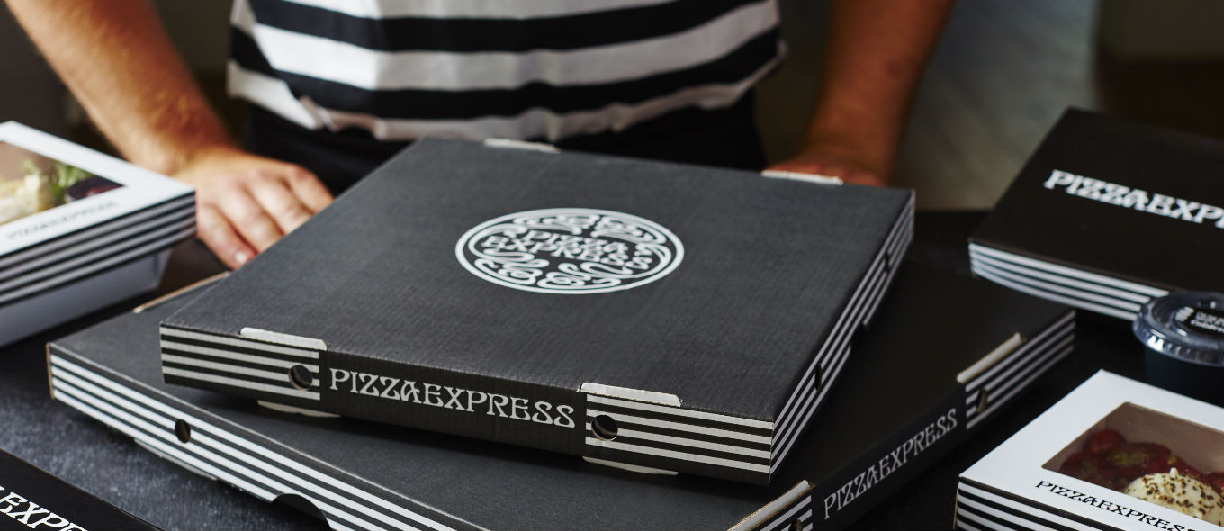
Pizza Express;
Image result for pizza express box
*black and white - monotone branding. Mainly black box - unique, contemporary, stylish. Simple logo on front, stripes down side.


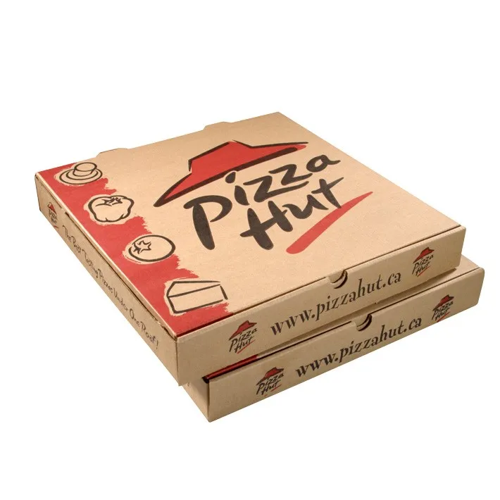
Pizza Hut;
Image result for pizza box
*red and black on unbleached card, authentic feel. Simple logo with vector icons down side. Basic yet bold and effective.


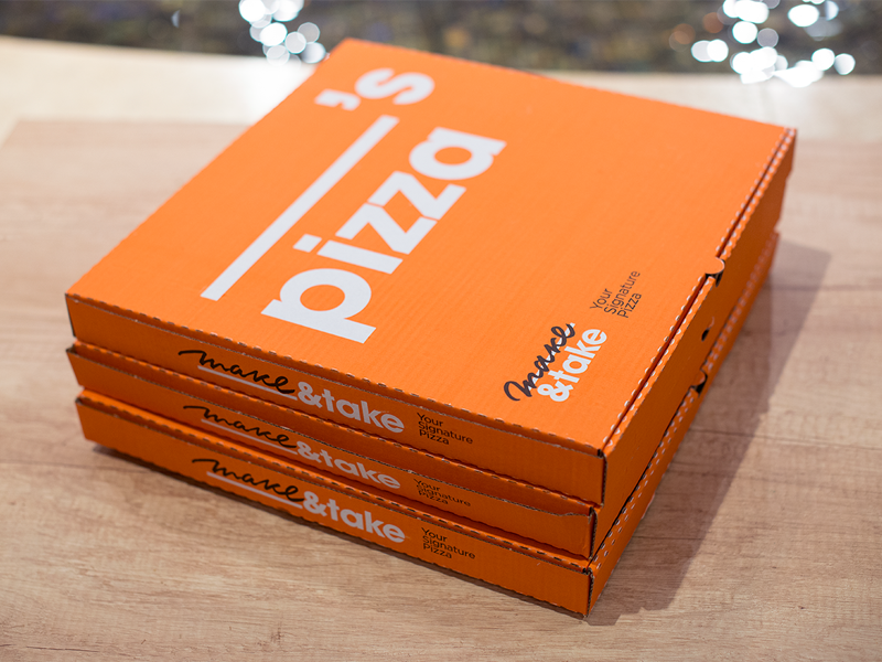
Make & Take;
Image result for pizza box
*simple yet effective concept - name left blank so pizza personal for anyone. Sans serif typeface quirky and modern. Bright orange unique and effective with white text. Moves away from traditional pizza box styles.


Papa Johnny;
Johnny Cupcakes x Papa John’s Limited Edition “Papa Johnny” T-Shirt Custom Pizza Box Packaging
*take on Papa Johns pizza but for cupcakes. Traditional red and green used on unbleached card. Quirky character central to design. Italian feel with bold sans serif typeface. Fair bit of text used.


Oven Fresh;
Related image
*quite a traditional style - red and green used on white box. Striking and eye catching. Vector outline of chef - adds handmade feel. Checkerboard recognisable. 


Thursday, 4 April 2019

OUGD603 - Baby Brand Collab - App Phone Mockups


OUGD603 - Baby Brand Collab - Final App Design


OUGD603 - Baby Brand Collab - Putting the App Together


Following the failure of the lookbook due to image quality issues, we decided that we would produce an online shopping app as well to further display our designs. Abigail left this up to me as she had no idea where to start with app design!

Putting the app together was a fairly simple process as we already had everything in place - imagery, typefaces, etc.

I had used Adobe XD before and found it quite easy to piece together.

I created the app pages within Illustrator,  using imagery and type that we had already created;


Front page of app/loading page;

*main hero image with brand name and logo, and loading circle in corner


Home page;


*home page of app, links to different elements e.g search, basket, featured products etc


Lift-Off Collection page;


*showing products from lift-off collection


Product page 1;
 
*planet romper product page/s


Product page 2;
 
*starlight leggings product page/s

Purchase/place order page;


Once I had created all the pages within Illustrator, I simply saved them as a JPEG and placed them into Adobe XD.


I then used the prototype tools to put together the app, adding the links and click buttons to make the app fully functioning;