Once I had come up with the logotype I was happy with;

I realized I was lacking inspiration for a colour scheme or any other graphics to go alongside this.
For some quick inspo I typed 'patterns' into google.

There was one image that instantly stood out to me;
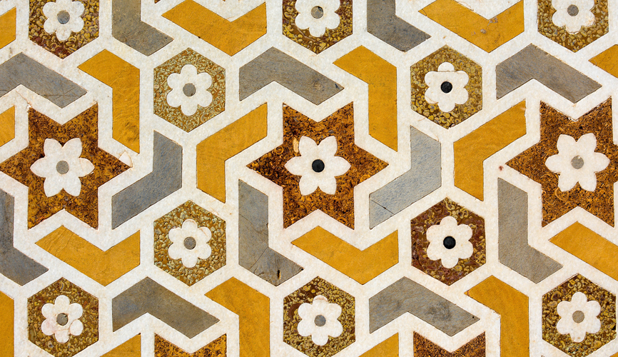
I just loved the colours used in this design. The mustard shade really popped out alongside the more neutral tones. It had a modern and fresh feel, yet also a cozy vibe.
I started experimenting with this in Illustrator;

Refining the logotype slightly;

Using rulers and guides to check alignment


Trying out the logotype on coloured background;

I then started to think about creating my own pattern to go alongside the logotype. This would feature of things such as the tissue paper around the cupcakes/muffins/cake you have purchased from them.
I wanted to go with a circular theme and take the 'o' as the main focus of the pattern. The circle represents the circular motion of the dough hook as it mixes.


No comments:
Post a Comment