Monday, 29 January 2018

OUGD505 - Design Practice 2 - Studio Brief 02 - Product Range Distribution - Analyzing the Brief Post Research


Your research work and ideas should reflect your own ideologies, concerns, and ambitions as a graphic designer.


Brief part 1 - develop a practical, visual and contextual investigation of a specific subject (an issue).

-Primary and secondary resources


Brief part 2 - Devise and develop a body of practical work that both distils your knowledge of an identified issue and demonstrates your ability to tap into the market potential for socially, politically and ethically-driven design.


Examples of potential deliverables include, but are not limited to:


• Materials relating to an issue-led campaign - recognizing dementia campaign, by current company

• Poster series / manifesto - new dementia charity

• Publication / book / zine / printed matter - info book on dementia aimed at younger gen

• Web / digital platform / video / moving image / animation - new charity website

• Range of products / merchandise that communicate your identified core message (placards, banners, set of badges, etc) - raising awareness merch

• Piece of real world ephemera (a product, a new currency, etc) - ??

• An installation, exhibition, social space, wayfinding / signage - wayfinding for dementia sufferers?


Friday, 26 January 2018

OUGD505 - Design Practice 2 - Studio Brief 2 - Product Range Distribution - Project Lembrar

Project Lembrar Print Ad -  Marriage Project Lembrar Print Ad -  Graduation Project Lembrar Print Ad -  Son

'Alzheimers erases even what you never thought you would forget'

OUGD505 - Design Practice 2 - Studio Brief 2 - Product Range Distribution - Brain Training


Alzheimer's Society has funded researchers at King's College London to test whether doing brain training games can improve cognitive function in older people. The study found that playing the games - which challenge people on reasoning and problem solving- can help people over 60 to get on better with their daily activities over 6 months. The researchers also saw improvements in reasoning and verbal learning skills in those over 50.

Work out which is the heaviest single object from the positions of the see-saws. Select the object you think is heaviest by clicking on it at the bottom of the screen. The better you get, the harder it becomes


A smash hit on Nintendo DS, the renowned Dr Kawashima’s Brain Training encouraged millions of users worldwide to keep their minds sharp with simple, daily exercises.
There are more than a dozen different numerical and verbal exercises to give your grey matter a workout, designed to be played for a few minutes each day. You can track your training with the in-built calendar, and test your progress by checking your Brain Age score.
Also included is a separate sudoku mode, for when you want a break from training!
Image result for brain training nintendo ds Image result for brain training nintendo ds

Image result for brain training nintendo ds screen play


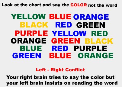
Image result for say the colour

Immediate Conditional Analysis


Immediate

synonyms:instantinstantaneous, on-the-spot, promptswiftspeedyrapidquickexpeditious;More


Conditional

synonyms:subject to, dependent on, depending on, contingent on, hingeing on, resting on, hanging on, based on, determined by, controlled by, tied to, bound up with


Analysis

synonyms:examinationinvestigationinspectionsurvey, scanning, studyscrutinyperusal;More


- Instant hanging on examination

- On the spot tied to study

- Prompt depending on scrutiny

- Speedy controlled study

- Quick bound inspection


-Black Mirror Nosedive - instant ratings on people

-Eye device - quickly scans someone naked


Wednesday, 24 January 2018

OUGD505 - Design Practice 2 - Studio Brief 1 - Micro-Genres of Music - Ideas


- Instruction manual to dance moves?

- Metal bin full of dollar bills - Andy Warhol - sticker of moon - studio 54

- Moon/spoon?

- Pants full of glitter

- Instruction manual how to look to get in nightclub - dos and donts (quiz, yes and no, go to page)


Monday, 22 January 2018

OUGD503 - Responsive - Starpack - Branding Ideas


I have been thinking of names for my 'fictitious' tea/coffee brand. I want something that reflects the luxury feel described in the brief, but also maybe something with a quirky element.

Related words/phrases;

- Tea proccess = harvesting, crushing, tearing, curling, oxidising, grading

- Barista

- Chemex (hourglass shaped filter coffee brewer)

- Clover (hi tec single cup brewing machine)

- Extraction

- Green beans

- Micro-lot (coffee from single farm)

- Nel drip - flannel drip - Japenese drip coffee filtered via flannel

- Puck (spent coffee from a portafilter or clover)

- Redeye - brewed coffee with espresso

- Siphon (coffee making device)

- Trifecta (hi tec single cup coffee brewer)

- Skilly (a weak tea or coffee - thin broth)

- Zarf/zurf (cup shaped holder for hot coffee cup)

- Steam room

- Aroma

- Mocha

- Grinder/ground up

- Java

- Steaming

- Spiced

- Express

- Ristretto

OUGD503 - Responsive - Starpack - Whittard


Founded in 1886, Whittard of Chelsea source the finest tea, coffee & cocoa from across the globe, and specialise in bespoke blends, equipment & tableware.


OUGD503 - Responsive - Starpack - Fortnum and Mason Tea


Fortnum & Mason, famous for their range of fine teas wished to introduce a premium range of selected fine and rare teas. The brief for Windette Associate was to create a concept that would draw on over 300 years of heritage with a strong appeal to international markets with a new iconic caddy shape.


"The new caddy was produced in a number of sizes including the large display caddies from which the loose tea is served. The retail consumer sized caddies were also required to become a ‘collectable’ and can be refilled. 


The design reflects the origins of Fortnum & Mason in the Georgian era and the influence of Chinoiserie in particular. A new physical shape caddy was produced with surface graphics and decoration which used the metal body material of the caddy to create a reflective finish. 
Each tea flavour has it’s own dedicated colour creating a ‘rainbow’ when merchandised. Cartons of Tea sachets correspond with the print detail by flavour."
Designed by Windette Associate, London 


OUGD503 - Responsive - Starpack - Sloane Fine Tea


At Sloane, we are an alliance of Fine Tea Merchants of premium specialty teas sourced directly from point-of-origin. We are the exclusive distributors in North America for the guild of gardens we represent, the most prized estate of which has been producing tea since 1899.
The stunning packaging, the taste of our teas, the beauty of its colour in your cup, and the enticing fragrance combine old-world charm and gentility into an affordable luxury beloved by gourmet food consumers and specialty gift collectors.
We are certified tea sommeliers, professional chefs, culinary educators, restauranteurs, and lovers of tea – a community of friends stewarding tea as gastronomy … we are Sloane!


OUGD503 - Responsive - Starpack - Wishbone Brew


The client and project overview:
Earlier this year we gave ourselves a challenge: to re-imagine the traditional approach to packaging coffee and create something that we could share with our clients and friends - and so, Wishbone Brew was born. Conceptualized and created by the team at AKA and assembled together by hand, it’s been a long time in the making — but worth the wait in order to share & enjoy it with some of our favourite people.
 
The design and creative solution: 
Our main objective was to re-think traditional packaging methodology. Used as a tool to showcase our ability to think & work beyond convention, we determined from the out-set that drawing inspiration from uncommon sources was essential to the success of the project. Cue the Terpentine: An attractive shape, an airtight seal, something unexpected. This container delivered on all counts, but how to break from the unfriendly, industrial, and for all intensive purposes toxic associations we as consumers have made with that form?
 
A bright yet soft colour pallette combined with elegant and approachable serif type helps soften the brand against the harshness of material. A quick sanding, prime, and dip in paint helps add some individuality among the products and re-enforces the handmade nature of the product, No two wishbones being exactly the same.


OUGD503 - Responsive - Starpack - Eta Tea


Eta Tea is going to make you love tea time even more—just look at these gorgeous tins! The concept, from Dickson Wong, honors the actual process of getting the perfect tea leaves to the consumer for brewing a delicious cup of tea.


“Eta, the seventh letter of the Greek alphabet (η), is often used as a symbol for seven in many academic areas. For the Eta tea company, it means the seven steps in tea making. The first six processing steps including harvesting, crushing, tearing, curling, oxidizing and grading, which the company have done perfectly for their customers. The seventh step is the final step in making a perfect cup of tea and the only step that takes place in the customer’s hand, brewing.Since Eta is a premium tea brand that only sells highest quality tea products, I traced back to the root of what premium tea meant back in the days when only the privileged could enjoy such beverage in the Western world. I took inspiration not only from old premium tea tins, but also luxury items like premium tobacco tins and vintage cosmetics packaging. I wanted to create a brand and packaging that convey the quality of the tea leaves it contains, and has a classic and elegant look with a hint of modern vibe.”


Using the actual steps of sourcing and creating good tea (and not just the brewing process) situates Eta Tea as a high quality product. Customers today appreciate knowing the story of the products they buy. An enchanting yet bold color palette livens up the vintage inspiration on the tins, with classic serif fonts and sophisticated graphics and accents. The round tins keep tea leaves fresh, but buyers will likely hang on to them long after they’ve emptied them out.


OUGD503 - Responsive - Starpack - Cha Le Tea


Cha Le Tea is a Vancouver based tea merchant importing high quality and rare teas from China. With a tiny, 640 square foot retail location that is both cafe and retail store, Cha Le is not your typical teahouse. Tea is carefully and scientifically brewed in Alphadominche steampunk brewing machines for perfect extraction and the best flavour. The interior design is more akin to a beautiful apothecary shop or bar — stark and architectural, made from wood and marble. Glasfurd & Walker developed the brand and packaging to illumatinate the space through bright copper tones and hand painted textures and pattern work.


A series of custom, watercolour prints to reflect the 6 categories of tea (white, oolong, black, green, herbal and pu’re) were hand painted and applied to custom boxes printed with flood copper foils on the top and bottom. Stickers are then applied with each tea type - detailing the specifics of terrior, location grown and tasting notes. Glasfurd & Walker also sourced custom, copper tins that have stickers applied with the painted artwork for the larger tea offerings. The logo by contrast to the high end finishing is simple and approachable - a nod to the name - meaning ‘happy tea’ in Chinese.


OUGD503 - Responsive - Starpack - Platform T


“To coincide with their brand launch and opening of their first tea lounge, Platform T needed packaging that embodied their fresh take on the tradition of tea. The custom copper tin with stamped logomark was designed to be sophisticated yet modern. The topographic pattern invites the drinker to dream of travel while the icons and typefaces show the brand’s playful nature. The smooth metallic tin contrasts the rustic wood and stone textures of the lounge’s interior. To further bring to life the lure of travel and the global story of tea, the packaging for their high-end reserve line was inspired by the ornate iron archways that frame train stations all over the globe.”