Monday, 20 February 2017

OUGD406 - Studio Brief 01 - Study Task 02 - Book Cover Analysis

Image result for the secret diary of adrian mole

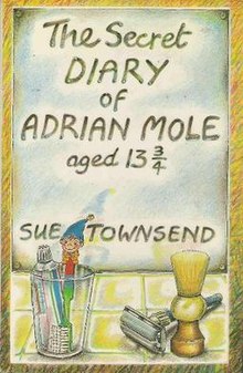
The above cover is the original released with the first edition of the book in 1982. The artwork was designed by illustrator Caroline Holden. Holden specialises in children's book design and is an author herself. This cover became so popular she was eventually commissioned to design the covers for the rest of the series. It was specifically requested for Holden to refrain from including the characters on the book covers, instead using objects and possessions to give a sense of personality. The coloured pencil style alludes to the idea that this a book for younger readers, without being too childish. There is a lack of bright garish colours usually seen on children's books, which again appeals to a young adult audience.The style of drawing is also similar to popular political cartoons at the time, which relates to the context of the book. The typeface is hand drawn and relates to the idea that the book is a diary and has a very personal and relatable narrative. The mirror plays a key part in making the book appealing to a wide audience  - readers can almost see themselves in the mirror and empathise with Adrian as a character.


Image result for the secret diary of adrian mole

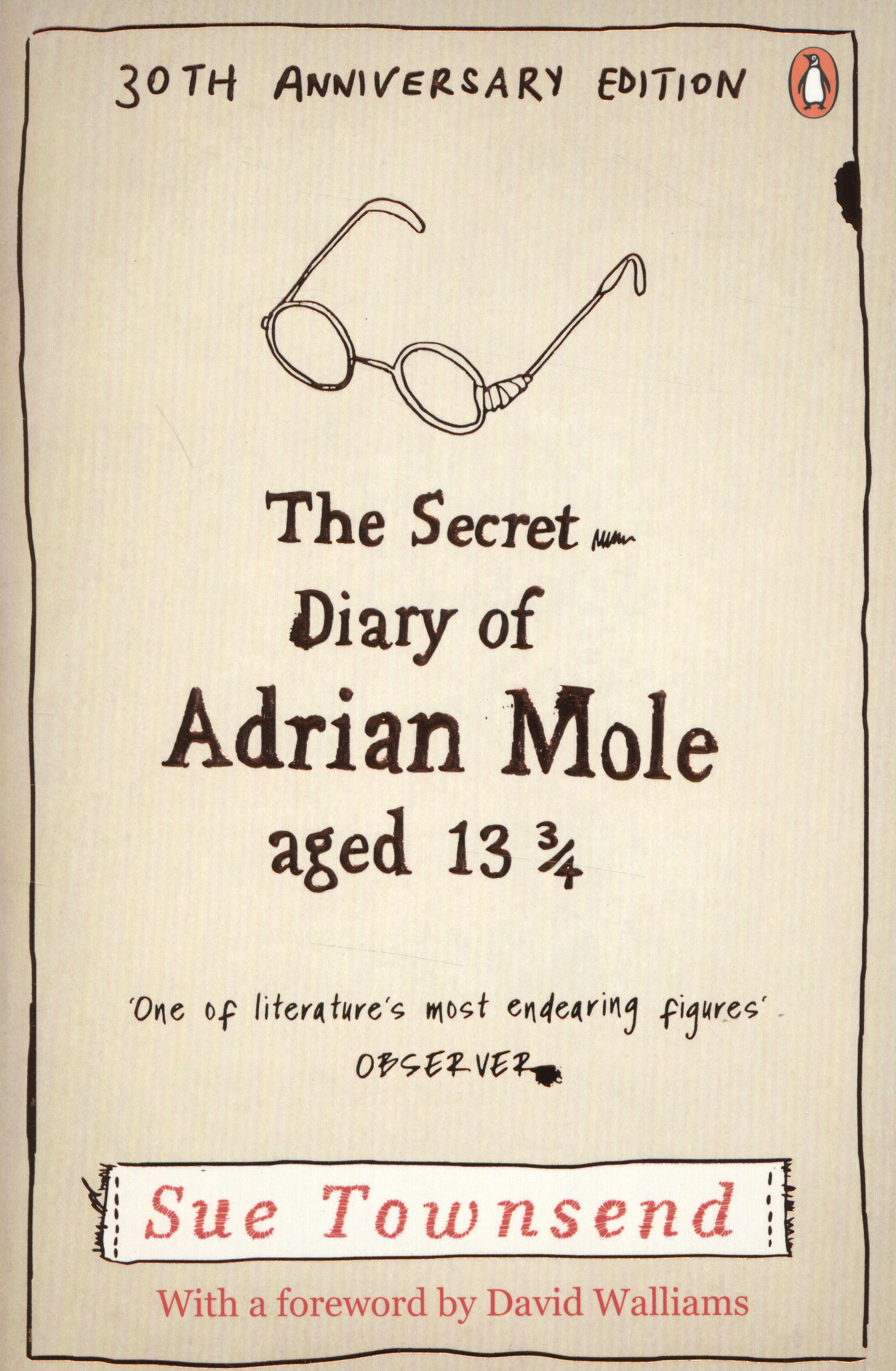
The above cover was illustrated by Roderick Mills and has a very hand-rendered style to it. This is the simplest of all existing covers for the book, with minimal imagery and no/neutral colour. Because this is the 30th anniversary edition, the overall design is very nostalgic and historic. This particular cover would not appeal to a younger audience and is located in the adult reading section of the book shop. The broken glasses relate to Adrian's troubles as a teenage boy, how he got bullied and the working class background of his family. This could also represent the state of the NHS at the time. The typeface used is traditional but with a hand-drawn feel to it, keeping it friendly and relatable whilst also appealing to an older audience. The overall cover would not appeal to younger children as they would be unlikely to even look at this on a shelf, in comparison with other bright and inviting book styles. This furthers the idea that the book can also appeal to an older and more mature audience.


Image result for the secret diary of adrian mole

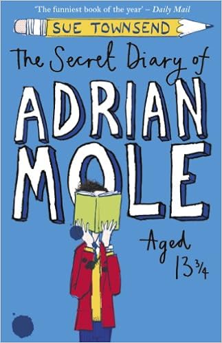
The above cover was designed by illustrator Joe Berger, who has also drawn for many other children's books such as Superhero Dad. Berger's certain style for children's illustration is the reason for the way this cover has been designed - perhaps a little too immature for the intended audience. This cover would stand out more on a shelf against the other two covers, but appears to have been designed with a younger audience in mind. Unlike the other covers, this one features a person - yet the face is still hidden to add an element of mystery. The reader can imagine themselves in Adrian's shoes. The typeface is very hand-drawn, again alluding to the diary style and personal narrative. Personally I feel this cover is inappropriate and not very well suited at all for the book's content. It appeals to a younger audience than the book is intended for.


Friday, 17 February 2017

OUGD406 - Studio Brief 01 - Ten Adjectives to Describe The Book


1. Naive

2. Humorous

3. Hapless

4. Unabashed

5. Misunderstood

6. Angst

7. Loveable

8. Exasperating

9. Solitary

10. Hypochondriac

OUGD406 - Studio Brief 01 - Study Task 01 - Books in Series


  • The Secret Diary of Adrian Mole, Aged 13¾ (1982), her best-selling book, and the best-selling new British fiction book of the 1980s.
  • The Growing Pains of Adrian Mole (1984)
  • The True Confessions of Adrian Albert Mole (1989)
  • Adrian Mole: From Minor to Major (1991) is an omnibus of the first three, and includes as a bonus the specially written Adrian Mole and the Small Amphibians.
  • Adrian Mole: The Wilderness Years (1993)
  • Adrian Mole: The Cappuccino Years (1999)
  • Adrian Mole and the Weapons of Mass Destruction (2004)
  • The Lost Diaries of Adrian Mole, 1999–2001 (2008)
  • Adrian Mole: The Prostrate Years (2009)

OUGD406 - Studio Brief 01- Study Task 01 - Full Book Synopsis


Before Harry Potter arrived on the scene, Adrian Mole was the most famous adolescent in English literature. Unlike Harry, Adrian Mole inhabits a comic, but very real world, filled with adolescent worries about love, sex, his future, and acne. The first in a very successful series of novels told in diary form, subsequent works record Adrian's struggles and successes into adulthood. The diary begins when Adrian is age 13 ¾, and ends with Adrian's fifteenth birthday. During the course of this year and a quarter, Adrian falls in love, suffers through his parents' marital problems, and pursues his ambition to be an intellectual and a writer. Pandora, the love of his life, is brainier than Adrian, and her parents are in a higher income class than Adrian's. She falls for Adrian after an uncharacteristic impulse to rebel causes him to wear red socks instead of the required black to school. Together they form a committee to continue the disruption. Frequent outbreaks of acne keep Adrian in fear that he will lose Pandora.
Adrian's other problems include being bullied in school, his increasing interest in sex, and his parents. Not exactly model parents to begin with, when their marriage breaks down, Adrian's home life becomes even more chaotic. After his mother runs off with the next-door neighbor, Mr. Lucas, Adrian's father, George, is temporarily cheered by his relationship with Doreen Slater. But when George loses his job, he sinks back into depression. Though she is annoying at times, often her house is the only place where Adrian and the family dog can find some peace. She also deals with Barry Kent, the school bully who demands protection money from Adrian on a daily basis. Another important member of Adrian's world is Bert Baxter, an old man whom Adrian helps out, and who, at one point, comes to live next door with Adrian's new neighbors, the Singhs, before being moved into an old folks home, where he meets Queenie. Later, they marry and set up house together. During a vacation in Scotland with his mother and her boyfriend, Adrian makes friends with an American boy named Hamish Mancini.
Despite these distractions, Adrian is determined to become an intellectual. He writes to a well-known TV intellectual, Malcolm Muggeridge, asking for information on how to be an intellectual but gets no response. He sends off a number of poems to the BBC, the national television and radio network, and is encouraged by the responses he receives from John Tydeman, who is obviously amused rather than impressed by Adrian's efforts. Toward the end of the year, Adrian's mother returns home, and shortly after, his father finds a job. Order, of a sort, is restored in the house before Adrian turns fifteen. He is now able to shave, but still legally a child and no freer to do what he wants.
Set in the early 1980s, in an unnamed town in the midlands of England, the novel portrays the effects on an ordinary working-class family of rising unemployment and cuts to education and medical services that defined the period. It was also a time when ordinary English women were beginning to express a desire for freedom from their traditional domestic roles, shown in the actions of Adrian's mother and those of Pandora and her mother. Because many of the words and references are likely to be unfamiliar to an American reader, the American edition provides an Afterword with explanations for these words. The Afterword takes the form of a letter exchange between Adrian and Hamish Mancini, an American boy Adrian meets in Scotland. Hamish asks for explanations for a list of unfamiliar words. In his letter, Adrian explains these words.

OUGD406 - Studio Brief 01 - Study Task 01 - Sue Townsend


- Died aged 68 - stroke

- Comic writer, novelist, playwright, journalist

- Spot a joke a mile off

- Ability to entertain without compromising her integrity

- Not in the least self important (like Adrian Mole)

- Born in Leicester, eldest of 5

- Could not read until 8 years old

- Failed 11 plus school, left school at 15

- Chain smoking teenager

- Fired from clothes shop job for reading secretly in closet

- Writing in secret by 14 years old

- At 18 years old, married a sheet metal worker

- 4 children

- Previous jobs = petrol station, receptionist, Birds Eye foods

- Been poor previously - made pea soup for children from OXO cube and tin of garden peas

- Went on canoeing course through working at adventure playground

- Adrian used to 'Nigel'

- Health issues = TB peritonitis, heart attack, arthritis, diabetic, blind, kidney failure

- Used her poor health in her novels (Adrians cancer etc)

- Life long socialist

- Bought two pubs

OUGD406 - Studio Brief 01 - StudyTask 01- Similar Books


Books of diary style for similar age group:

- The Princess Diaries - Meg Cabot

- My Mad Fat Teenage Diary - Rae Earl

- Angus, Thongs and Full-Frontal Snogging - Louise Rennison

- Submarine - Joe Dunthorne

- My So-Called Life - Joanna Nadin

- My Secret Diary - Jacqueline Wilson

- Polly's Running Away Book - Sally Gardner

OUGD406 - Studio Brief 01 - Study Task 01 - Book Analysis


"Adrian Mole’s painfully honest diary is a hilarious spots-and-all glimpse into the troubled life of a teenager. First published in 1982, it quickly became a best-seller and has since been adapted for radio, television and theatre."


"Meet Adrian Mole, a hapless teenager providing an unabashed, pimples-and-all glimpse into adolescent life. Telling us candidly about his parents' marital troubles, The Dog, his life as a tortured poet and 'misunderstood intellectual'"

- Set in 1981-1982


- Historic world events of time: Falklands War, Prince Charles & Diana wedding, Prince William born

- Mole = fierce critic of Margaret Thatcher - worst enemy

- Naively yet confidently misinterprets events around him

- Genre = young adult novel - 12-mid teens - younger kids do not understand

- Mole - unfortunate, unabashed (not embarrassed)

- Craze swept through schools - eventually banned in one school

- Mole - ABBA fan - wore flares in early 1980s. Obsess over penis size. Porn mag - Big & Bouncy

- Book released three days after The Smith's first gig - "zero hour of selfish 80s angst"

- Sue Townsend author - "Not written for teens. Parents = intended audience. Mothers of teenage boys"

- Mole = loveable and exasperating - defining emotions of parenthood

- Mole - on/off girlfriend - Pandora

- Midlands sense of humour

- Obvious reading book back as 40 year old

- Mole = self obsessed, hypochondriac

- Repainted bedroom - Noddy wallpaper showing through

- Book = slight whiff of forbidden, racy stuff for time - sexuality and boys that age

- "solitary voice of sanity in world gone mad"

Thursday, 9 February 2017

OUGD405 - End of Module Evaluation

During this module, I have learnt a lot about practical and conceptual approaches to research and problem solving. I have enjoyed developing my research further and learning how to properly inform my work by substantial preparation and research.  Doing this has improved the quality of my work and helped inform my design decisions.

I have also developed an awareness of issues relating to form and function. In Studio Brief 01 I had to really think about how these two things would play a part in my designs. I did lots of research into existing wayfinding systems and how they worked with these two factors in order to be successful. Looking round Leeds and documenting these signs helped inform my own decisions when it came to designing the signs for my own personal system.

Similarly, I used research to help my ideas with the object project. My chosen object was a pair of pants, and I completed a variety of tasks in order to thoroughly explore my object in multiple different ways. I used a variety of different softwares and processes to document my findings, allowing me to really ‘get to know’ my object.

Message and communication are also important things that I have learnt more about during this module. Looking at both objective and subjective sign systems has developed my knowledge on how messages can be portrayed in different ways. We could have designed a very objective system, based on facts. This would have been very formal, official and most importantly – universal for everyone. On the other hand, we could have designed a very subjective sign system, based on opinion and our own particular views. I chose to incorporate the two within my own system, using both a personal narrative alongside a formal and official style of aesthetic.

I also used message and communication when designing my object publication. I wanted to appeal to a large audience and put across a certain ‘vibe’, which I feel I did successfully due to thorough contextual research and planning. Whilst my booklet did not necessarily contain much information, I wanted to communicate a relaxed and informal tone whilst providing the audience with some humour and fun.

I believe that my recording and documenting skills have definitely improved, especially with the first studio brief. The rigorous research process we went through at the beginning of the project really helped me to develop my understanding of where a project can lead to if proper development is done. This was also significant within Studio Brief 02, where I would have found it more difficult to produce an outcome­­ had I not gone through a thorough development process in the beginning.

Overall, I have really enjoyed this module and feel it has definitely helped deepen my understanding of how to properly prepare for a producing a successful design outcome. The main thing I have learnt is that process it key to pushing a project forward and really expanding your ideas into new and unexpected places.

Wednesday, 8 February 2017

OUGD405 - Studio Brief 02 - Object Evaluation

I feel as though my project was fairly successful and effectively communicates my research.

Including different names for underwear, discovered through my research, provides a point of interest and is also informative in a light hearted and informal way.

I also believe that using different typefaces and playing around with form and layout is a great visual guide and allows the audience to relate word to its visual counterpart.

My first initial ideas were not as successful as I would have liked - the overall aesthetic was not getting my intended message across and the visual were not working in a fun and contemporary way.
Researching for other sources of inspiration really helped drive my work forward - influences from other designers and styles helped my define exactly what I wanted to achieve within my publication.

Looking at how other designers such as Ivan Chermayeff used type to present words visually informed my own design decisions and allowed me to create sophisticated visuals that represented my intended idea.

I feel including a 1980s aesthetic to my publication helped solidify my design intentions - I wanted to produce something that could play on the idea of being ‘tacky’ and ‘cheesey’ whilst clearly doing it with intended sarcasm and irony.

I do think there are limitations with my final outcome - there is technically no ‘real’ purpose for the book - it is simply for a bit of fun and is a novelty style product. I don’t personally think I could take this much further than I have done - using the typographic elements only stretches so far.

Overall I am happy with final outcome as it performs exactly the way I intended it to, but I understand there is room for improvement, such as refining my design style and making my work more contextually informed with other designer’s work.


OUGD405 - Studio Brief 02 - Final Designs

I have placed all the separate elements from my design process into one publication, creating my finished booklet.

I am really happy with the overall result and think it looks really effective and eye-catching.

I am planning on printing the publication and binding it with a pamphlet stitch.


OUGD405 - Studio Brief 02 - Pattern Designing


Using colours and geometry inspired by 1980s design style, I have been creating some vector shapes to include within my publication alongside my typography and found photography.

I think this will give the booklet a finished look and help tie it all in together nicely.

OUGD405 - Studio Brief 02 - Refining the Publication

I have decided to swap from a pants-shape booklet to a regular rectangular one as I feel this is not only more contemporary but also suits my audience better.

I have picked a vintage/retro colour scheme in order to appeal to the novelty, 'tacky' element of my booklet.

I have also done some research into found photography from the 1980s and decided to include this within my design. I think this suits my design well as it links in with the funky retro style that I am aiming for.


I have also started to experiment with Ivan Chermayeff's style of typography, playing around with the letters within the words I have chosen. For example, I placed the ‘g’ under the word ‘thong’ which emulated the shape of an actual thong. Similarly, I placed ‘ndies’ under the ‘u’ in ‘undies’ to represent how it is underneath.


I really like this style and would like to take it forward into my future designs.

OUGD405 - Studio Brief 02 - Design Development


After deciding to base my publication around typographic presentation of different names for under, I began designing my publication. I started with a basic underwear shape for the shape of the booklet, with the type placed over the top.

I felt this wasn't working too well because it was too plain and boring for the aesthetic I was after. The text was too flat against the background and not engaging enough.


I then experimented with a different style of pants to make things more visually interesting, also changing the text to all white. I thought this definitely looked better than the previous designs, but also wasn't exactly what I wanted. I felt this looked to childlike and did not reach out to the audience I had intended.


I have decided to do some research into different design movements and eras in order to help me with the theme of my booklet. I think researching will help me solidify a design aesthetic that will be appropriate for my publication. 

OUGD405 - Studio Brief 02 - 1980/1990s Patterns


I want to emphasise the tacky and retro theme of my publication, so I did some research into 1980s/1990s patterns and advertising. I really like the garish, bright colours and geometric patterns that come with this style, so I have decided to incorporate this within my own work.

http://gizmodo.com/why-a-once-hated-1980s-design-movement-is-making-a-come-1602111413

The article above is about how 1980s style design is making a comeback. I found this particularly interesting and feel as though this gives me more of a reason to include this style within my own work.
1980s Retro Fashion Patterns by wingsart for adobe photoshop and illustrator          Image result for mtv 1980 logo


OUGD405 - Studio Brief 02 - Ivan Chermayeff

 I have discovered graphic designer Ivan Chermayeff's book 'Watching Words Move' and think it would be a great source of inspiration for my project.

"First published in 1962, this work of experimental typography uses letters in a single typeface, Helvetica, to achieve surprising results - motion and narrative, emotion and humour" - http://www.cghnyc.com

I would like to experiment myself with typography and how I can play around with its format and layout in order to visually represent the specific word. I think this could work well within my publication and be an interesting element to include.

Image result for ivan chermayeff making words move   Image result for ivan chermayeff making words move

OUGD405 - Studio Brief 02 - A-Z Books


One of my ideas is to create an information book on underwear, containing facts figures and imagery regarding pants and their history.

I have been inspired by A-Z books and the way they work, such as 'A-Z of Coffee' or 'A-Z of 21st Century Cars'. I think the format to these books are interesting and the way they act as an encyclopedia for one specific subject is something I think I could work with. It would be interesting to have an 'A-Z of Underwear' booklet full of information about underwear's history, origins and relevant facts.


Image result for a-z of bookImage result for a-z of cars book

OUGD405 - Studio Brief 02 - Humans of New York


Humans of New York is a photography project by Brandon Stanton started in summer 2010. Brandon takes pictures of a variety of people around New York city as well as a quick interview, and then documents this on a blog, which has since become a book.

I was inspired by this as I want to create something similar, but for underwear. I would like to photograph a variety of different underwear/styles, and put this into a photgraphical publication like Humans of NY. I think it would be interesting to have a small bit of text accompanying each image with some information on each pair of pants. On the other hand, it would be interesting to have no text whatsoever just a photo book.

Image result for humans of new york book

OUGD405 - Studio Brief 02 - Initial Ideas

 My first initial idea was to create a small publication that included drawings/photograph of different types of pants.  This would be a small booklet that showcased the large variety of underwear that exists around the world, and act as almost a ‘look-book’ for people to browse through. There would be little to no text as this booklet would be based entirely on imagery/photography. This would be similar to photographer Brandon Stanton’s ‘Humans of New York’ book in which he depicts the vast and varied amount of different and unique people within New York.

My second idea was to create and information booklet on underwear. This would include the history of underwear, the different types, how it varies around the world etc. It would be a small A6 size publication that would be a mainly text based with a small amount of imagery too. It would be inspired by books that follow the title of ‘A-Z of...’., such as ‘A-Z of Animals’ or ‘A-Z of London’ etc. I want to create a booklet in a similar style, but instead ‘A-Z of Underwear’

My third and final idea was based on my typographic exploration completed in my research. I really liked this exercise and feel I could develop it further. I want to create a small publication that uses typography to explore the different types of pants/different names for pants in a visual way. After receiving peer feedback, it was decided that this would be the most effective of my three ideas and links best with a graphic design style outcome.

I made a few different mock ups whilst playing around with layout and format. I wanted to see how the booklet would look in the actual shape of underwear, or how I would produce and bind my publication in order to suit the content inside.


Tuesday, 7 February 2017

OUGD405 - Studio Brief 02 - Typographical Exploration

Next, I explored my object typographically.

For each word, I downloaded a typeface I felt relevant to that specific word - for example, a girly, love heart font for the word 'thong'.

I repeated this multiple times, picking fonts I felt appropriate for each different name.

I also used colour to represent each word - pinks for 'girlier' words, and darker colours for 'manlier' words.


OUGD405 - Studio Brief 02 - Illustrator Song Drawings

Our next task was to find a piece of music that links with or represents our object, and then create 5 visual representations of this in Illustrator.

The song I chose was Thong Song by Sisqo as I felt this best represented my project whilst adding a humorous side.

https://www.youtube.com/watch?v=Oai1V7kaFBk

I drew the pictures whilst listening the song, following the beat and rhythm. I also watched the video for the song and attempted to represent the feelings I got from it using line and colour.

OUGD405 - Studio Brief 02 - Microsoft Excel Drawings

We then had to create 10 different drawings of our object in a spreadsheet program such as Microsoft Excel.

I started by drawing a basic pair of y-fronts, and then some hearts to represent underwear's link to love/lust etc. I drew legs wearing different pants, and also sets of women's undewear.

I also played around with the idea of a pulse rate and how it increases when looking at underwear/people wearing it etc.


OUGD405 - Studio Brief 02 - 10 Pictures in Text Editing Program


The second task was to create 10 pictures regarding your chosen object (pants) in a text editing programme. I chose Microsoft Word to work with. I used a variety of different names for pants such as loincloth, briefs, panties etc and created a shape/object that resembled this.

I chose the word 'panties' and put it in a small thin typeface in order to represent the delicate feel of the word. Similarly, I arrange the letters of 'loincloth' in various different sizes in order to create the shape of a pair of pants.

I placed the word 'briefs' inside a large B to represent a bum, with the rest of the word inside. G-string was created by using a large G with the rest of the word coming off and resembling the shape of the actual pair.

For 'knickers' and 'pants' I played around with layout and formation, creating circular designs and layers over letters.

Boxing gloves make up the word 'boxer's, a play on words for both items.

I used a Y to create the shape of the Y-front style pants.


OUGD405 - Studio Brief 02 - Underwear Research

I have chosen a pair of pants/underwear for my object research.

Nick Sharatt Pants book - illustrations.


Early Underwear
The ancient Egyptians sometimes wore loincloths. The Romans also wore underwear. Both Roman men and women wore a loincloth or shorts called subligaculum. Women also wore a band of cloth or leather around their chest called a strophium.
During the Middle Ages men word linen shorts called braies but women did not wear knickers until the 19th century. Their only underwear was a long linen garment called a shift, which they wore under their dress. From the 16th century women wore corsets made with whalebone.

19th Century Underwear
In the 19th century underwear became much more elaborate.
Where does the word does the word pants come from? It is derived from a character in Italian comedy called Pantalone. He wore garments that came down to his ankles (when most men wore ones that came to the knee). In 18th century England they were called pantaloons. In the 19th century the word became shortened to pants. In Britain pants came to mean long drawers that covered the whole leg. The garments worn over them came became known as trousers.
The word drawers was invented because underwear was drawn on. Where does the word knickers come from? It comes from a novel called History of New York by Diedrich Knickerbocker, supposedly a Dutchman living in New York (it was actually written by Washington Irving). In Britain the illustrations for the book showed a Dutchman wearing long, loose fitting garments on his lower body. When men wore loose trousers for sport they were sometimes called knickerbockers. However women's underwear were soon called knickerbockers too. In the late 19th century the word was shortened to knickers. In the USA women's underwear are called panties, which is obviously a diminutive of pants.
At the beginning of the 1800s women still wore a long nightie-like garment under their dress but it was now called a chemise not a shift. However after about 1800 they also wore drawers. Sometimes they came to below the knee or sometimes they were longer garments with frills at the bottom called pantalettes. However by the 1830s only girls not women wore pantalettes.
Today we still say a pair of knickers or panties. That is because in the early 19th century women's underwear consisted to two separate legs joined at the waist. They really were a 'pair'.
At first women's drawers were usually very plain but in the late 19th century they were decorated with lace and bands. In the Winter women often wore woollen knickers and woollen vests.
Victorian women's underwear were sometimes called bloomers. Elizabeth Miller invented loose trousers to be worn by women. The idea was promoted by Amelia Bloomer from 1849 and they became known as bloomers. In time long underwear became known as bloomers.
By the late 19th century in Britain men's underwear were called pants. Men also wore vests. Some men wore combinations, pants and vest in one garment.

Life in the 19th Century
20th Century Underwear
In the 19th century women's underwear was usually open between the legs but in the 20th century closed knickers replaced them.
Meanwhile in 1913 Mary Phelps Jacob invented the modern bra. She used two handkerchiefs joined by ribbon.
In the 19th century knickers came down to well below the knee. In the 1920s they became shorter. They ended above the knee. By the 1940s and 1950s many women wore briefs. In the 1970s knickers became briefer still. In the 1990s thongs became popular. Men's underwear also became shorter. The word drawers went out of use and they became known as underpants or pants. Y-fronts went on sale in the USA in 1935. They went on sale in Britain in 1938. Boxer shorts were introduced in the 1940s.
Panties in American English (typically called knickers in British English) are a form of underwear worn by women. Panties are most often form-fitting, but may also be loose. Typical components include an elastic waistband, a crotch panel to cover the genital area (usually lined with absorbent material such as cotton), and a pair of leg openings that, like the waistband, are often made of elastic. Various materials are used, but are usually chosen to be breathable.
Panties were originally designed to cover the entire lower half of the female torso,[1] since the 1970s panties have had either no legs or, in some cases, very short ones, and have become increasingly briefer over time.


OUGD405 - Studio Brief 01 - Wayfinding Evaluation

Personally I feel as though my approach to the brief was fairly successful.
My wayfinding system challenges both the objective and subjective approach to wayfinding. Objectivity is based on fact, which links in with the history I have based my project around within Leeds. This is universal and everyone can understand it and ‘be a part of it’ as such. I have adhered to this by making my system about true facts and real life - it is something people can relate to and reminisce. The way I have designed my system is also fairly formal and official - from the typeface I have chosen to the simplistic arrow style. This again relates to the objective approach and demonstrates an unbiased and impersonal element to the project.

On the other hand, my wayfinding system also has a subjective approach to it too. This is demonstrated by the personal narrative that my system is based around. This is a very particular element to my designs - the quotes included within my system could be said to be opinion based, which is a subjective element to my wayfinding.

I believe some of my design decisions were successful, such as the research into colour theory which allowed me to appropriately choose an effective colour scheme that suits my purpose.  I also think that using Otl Aicher as an inspiration for my designs worked really well and allowed me to create an effective and professional set of pictograms.

Contrastingly, I feel I have made some unsuccessful design decisions such as my first initial sign and place poster designs, as after peer feedback I realised these were not linking in with the aesthetic of the rest of the system.
I feel as though I got carried away with the design process and tried to include too many elements/bits of information within my posters etc.

Looking at simplistic and minimalist design styles such as Josef Muller Brockmann’s work helped me create work in a similar style, allowing me to stick with a clear and legible approach.

I think that my overall outcome could be improved by developing it further - I believe it would be interesting to sway more towards the subjective side and make my sign system very personal. I would like to include more of my family’s personal experience and history as I think this would add an interesting element to the overall system. The downside of this is that the system would then be less accessible for other people - the audience would become a lot smaller as people would not be able to relate/understand the ideas behind my system.

Overall I feel as though my project has been successful - I have been able to achieve a functional and visually pleasing wayfinding system that is clear and easy to follow. It is accessible for all ages and abilities and includes personal touches that help tell a narrative/story, adding intimate elements to an otherwise factual and historical journey.