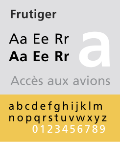
In 1968 designer Adrian Frutiger was commissioned to created a sign and directional system for the new Airport Roissy, which was later named Charles de Gaulle Airport in Paris. The font created was bolder than original typesetting fonts which made for better legibility within the light boxes of the signage system. Letterforms were worked on carefully by Frutiger to ensure that characters and words could be recognised in poor light conditions or when moving quickly past the sign. Tests were done to see if unfocused letters could still be recognised.
Personally I think Frutiger's typeface is very legible and easy to understand, which makes it ideal for use within a signage system. I believe that the lack of serifs help keep the font as clear as possible and the bold style helps it stand out when put into context.

No comments:
Post a Comment