Friday, 16 December 2016

OUGD405 - Blackletter Research


Blackletter is a typeface characterised by condensed lettering and tight spacing. The letterforms are dominated by evenly spaced verticals. The condensed style meant that the amount of costly materials used in book production were reduced.

Blackletter can often be referred to as Old English or Gothic, but these terms are not entirely accurate. Blackletter is actually a term to describe the scripts of the Middle Ages in which the darkness of the characters overpowers the whiteness of the page.

Textura and Rotunda are the two basic blackletter scripts and they are associated with both northern and southern Europe. Both of these scripts are book fonts.

Image result for black letter

OUGD405 - Studio Brief 01 - Study Task 03


For our final study task, we had to create marks and strokes in a blackletter style. These marks and strokes then had to put together to create our own version of hospital signs that could be abstract but had to work functionally. I used a variety of tools to create my marks - angled brushes, thick painters brushes, ink and angled marker pens.


I started by using the ink and brushes to create a variety of strokes in the blackletter style. I really liked the effect, especially when the ink started to run out and you could see brushstrokes within the line.


I then tried the same thing but with ProMarker pens, using the flat angled end. I definitely preferred the effect this tool gave me as not only was it easier to control but it also gave me a bolder, stronger line.


I took a few sheets of the marks I had made and cut them out into singular pieces. From these pieces I began to form particular signs by using standard hospital signs as a guide.


From left to right (below): telephone, café, pharmacy, arrow, prayer room, stairs, male and female toilet sign.

I really liked how my signs/symbols turned out, the singular marks worked well when placed together and created a contemporary style that still carried traits of traditional blackletter style.


After scanning in my chosen signs, I traced them in Illustrator and placed them within a box so that they had a border/restraint around them. I originally coloured them with the initial colours I had used when creating the marks with pen.


Whilst I liked the contrast this had, I didn't feel it was appropriate for a hospital setting. I then chose a white and mint green, stereotypical colours for a medical environment.


I felt this definitely looked more appropriate and would fit in better within a hospital setting. To see my designs in context, I used Photoshop to impose them onto a picture of a hospital area.


I think my designs looked fairly effective within context and I think they are appropriate for the use. I don't think they particularly 'stand out' but this could be adapted and changed by making the arrows bolder and bigger and adjusting the colours slightly.

OUGD405 - Studio Brief 01 - Study Task 02


For this study task, we had to create objective symbols of subjective things. We were given a list of words to pick from and we had to create symbols/signs based on a visual representation of this word.

The first word I picked was 'sensuous'. I began by drawing circles - the word sensuous made think of flowing curves, so I used a circle as my restraint - I could only draw circles inside an actual circle itself.


I then used a line as my restraint - I cut multiple pieces of tape at the same length and simply cut into them in an attempt to represent my chosen word.


I explored this idea of restraints further by creating symbols only from circular pieces of tape - I also tried this with rectangles to see how this would compare.


I started to explore with letter forms after deciding the most 'sensuous' letter of the alphabet was an 'S'. I picked a font that I felt matched the word best and then played around with multiple 's' inside a circle to represent a sign.


I also played around with graph paper and how I could represent a sensuous feel whilst being restricted to a grid format. I felt this was less successful as it was hard to demonstrate the word with such sharp and angular forms.


I then looked at the word 'anxiety' or 'anxious' and chose to represent this with sharp, spiky formations. I felt this best represented anxiety as it had a particular unsettled feel. The lack of the flowing curves used for the previous word demonstrated the difference between them.


I also looked at the word 'irritant' and again played around with more sharp, disjointed imagery. I used a brush tool on Illustrator that I felt had a particular 'scratchy' appearance which I think represented the word really well.


Again I explored with letter forms and chose to play around with the letter 'I' to represent irritant. I think an exclamation mark is another good representation of irritants so I also included this within my designs.

Overall I found this task quite difficult as it was really hard to create a visual representation for subjective things. I did enjoy the challenge though and it has certainly taught me more about visual language.

OUGD405 - Studio Brief 01 - Study Task 01 Analysis

Using all our research collected previously, we chose to test people's reactions when something unusual was placed on the floor. We began by using tape on the floor to create a hopscotch. This was not successful as not a single person actually 'played' on the hopscotch, people either simply walked round it or straight over it. It was interesting when people walked round it as it suggested that people would react to something that was abnormal and purposely go out of their way to avoid it. A small number of people did actually ask us what we were doing, but I think this was mainly because they were just curious/being nosy! We also chose to challenge Frutiger's ideas on arrows/angles pointing up and down and chose to divide the steps at Liberty Park into two sections - up and down. Our aim was to see if people followed the correct route/set of stairs. This idea was definitely more successful than the other idea as people did seem to pay more attention to this, but I'm not sure whether this was just coincidence or even subliminal.

Overall, I feel our ideas could have worked better or been more successful if we had more time or better resources. Both the hopscotch and arrows idea could have been developed further and I think they could have produced a better outcome if this had been done. Also, filming for a longer period of time may have given us some better footage and more reactions.

https://vimeo.com/192999993

OUGD405 - Josef Muller-Brockmann


Josef Muller-Brockmann is one of the most well-known Swiss designers classified as part of the Swiss International Style. He was influenced by several different art and design movements such as Bauhaus and Constructivism. He was born and raised in Switzerland and even taught at the Zurich school of arts and crafts.

He employed a grid-based design as his graphic expression which was free of any subjective feeling or ornamentals. His book 'Grid Systems in Graphic Design' became one of the most iconic go-to books for graphics designers worldwide. He worked in a minimalist, geometric design format and was the main designer responsible for introducing the grid within graphic design. He stated himself that he aspired to attain a distinct arrangement of typographic and pictorial elements. His work is best known for its simplicity and clean use of typography.

Image result for josef muller brockmann   Image result for josef muller brockmann   Image result for josef muller brockmann   Image result for josef muller brockmann

Tuesday, 13 December 2016

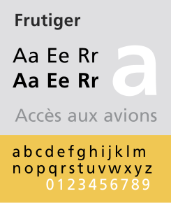
OUGD405 - Frutiger Analysis


In 1968 designer Adrian Frutiger was commissioned to created a sign and directional system for the new Airport Roissy, which was later named Charles de Gaulle Airport in Paris. The font created was bolder than original typesetting fonts which made for better legibility within the light boxes of the signage system. Letterforms were worked on carefully by Frutiger to ensure that characters and words could be recognised in poor light conditions or when moving quickly past the sign. Tests were done to see if unfocused letters could still be recognised.

Personally I think Frutiger's typeface is very legible and easy to understand, which makes it ideal for use within a signage system. I believe that the lack of serifs help keep the font as clear as possible and the bold style helps it stand out when put into context.
Image result for frutiger font           Image result for frutiger signs

OUGD405 - Lance Wyman


Lance Wyman is a graphic designer from America and is well known for his design of the Mexico City Metro pictograms in 1969.

These pictograms introduced a brand new way of thinking into wayfinding and sign systems. So that the signs could be understood by everyone, Wyman created a series of symbols for each station that could also be expressed verbally. This meant that people with poor to no literacy skills or non-speaking visitors were able to find their way around the city without any issues, changing the entire philosophy for visual communication. For example, the station in La Candelaria, named "Candelaria, the District of Ducks" took it's name from the many criminals living in the area. These criminals were nicknamed 'ducks' by local people, and this led Wyman to use a duck as the pictogram for this particular station. This meant there was now a visual and verbal identifier for this area.

Personally I believe this sign system is very effective as it appeals to a vast and wide audience and is universally legible. I feel this particular method should be adopted in other areas and countries as it would definitely help the general public navigate their way around spaces quicker and easier.

Monday, 12 December 2016

OUGD404 - Pantone My Street


The scene/street I have chosen is on Woodhouse Lane just outside Leeds Beckett University. I chose this particular scene because I liked the gritty urban feel it had to it with the boards, derelict building and crane in the background. I also felt the grass and tree added a nice contrast to this. I selected a small area and swatched 12 colours from this. I was shocked by the variety of colours I got just from this small section and could not believe how many different shades I could pick out. I feel like the swatches I collected have quite an earthy tone to them, with lots of greens, blues and beige tones. Alongside this, the artificialness of the red graffiti and crane added an extra element to the swatches and created an interesting contrast.

c

OUGD404 - Colour Theory


Colour theory is a set of principles that is used to help create harmonious colour combinations. The first colour wheel was invented by Sir Isaac Newton  - he split white sunlight into red, orange, yellow, green, cyan and blue beams and then joined the two ends of the spectrum together to show the natural progression of the colours. He associated each colour with a note of a musical scale. A century later, Johann Wolfgang Goethe began studying psychological effects of colours. He noticed what whilst yellow has a warming effect, blue gives the feeling of coolness. He divided the colours into two groups, the plus side and the minus side.

Relationships can be represented visually with a colour wheel, which is the colour spectrum wrapped onto a circle. According to the theory, harmonious colour combinations include any two colours opposite each other on the wheel, any three colours spaced around the colour wheel forming a triangle, and any four colours forming a rectangle – two pairs of colours opposite each other. These combinations are called colour schemes, or colour harmonies. These schemes remain harmonious regardless of the angle of rotation. There are 6 different classic colour schemes used on a colour wheel. The monochromatic colour scheme uses variations in lightness and saturation of single colours. They go well together and create a soothing effect, easy on the eyes. The analogous colour scheme uses colours that are next to each other on the wheel. One colour is used as the dominant colour whilst the other adds to the scheme. The complementary colour scheme consists of two colours that are opposite each other on the wheel. This is a high contrast scheme that uses warm colours against cool ones. The split complementary scheme is a variation of the complementary scheme – instead it uses a colour and two colours next to its complementary.  The triadic colour scheme uses three colours equally spaced around the wheel. This is not as contrasting as the complementary but appears more harmonious and balanced. The sixth and final colour scheme, the tetradic colour scheme is the most varied of them all, using two complementary colour pairs. It is hard to harmonize as it may become unbalanced, so you must have a mix of dominant and subdued colours.­


OUGD404 - Josef Albers


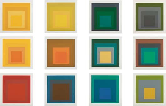
In 1963, Josef Albers released his iconic book –‘Interaction Of Colour’. This was a brave and radical experiment at the time, a new way of looking at and understanding colour. Now, half a century later, this book is just as relevant and important as it was when it was first released. Part of Albers’ belief is that a colour ‘has many faces’, which means that a single colour can appear as two different ones when combined with other colours. This was demonstrated by creating contrasts with paper strips – he split a long piece of brown paper with yellow and blue strip, which then made the brown appear two different shades on separate areas of the strip. Albers has a large emphasis not only on seeing colour, but feeling the relationships between colours too. He uses a visual example called the ‘afterimage effect’, which demonstrates the interaction of colour caused by ‘interdependence of colour’. On the left of the image, there is a white square filled with yellow circles and a black dot in the center. On the right hand side of the image is another white square, but this time with just a black dot in the center. After staring at the left image for 30 seconds, the right hand side of the image appears to be filled with diamond shapes, the ‘leftover’ of the circles. This reversed afterimage illusion is called contrast reversal.
                                              Image result for josef albers homage to the square

OUGD404 - IKB - International Klein Blue


Klein blue is a deep blue created by Yves Klein. It has a heavy reliance on Ultramarine and its visual impact is related to Klein’s thick and textured application of paint to canvas. ‘IKB 79’ was one nearly two hundred monochrome paintings Klein made during his career. His aim was to create a way of rejecting the idea of representation in painting and therefore attain creative freedom. The letter IKB stand for International Klein Blue, a deep ultramarine that Klein registered as a trademark colour in 1957. He associated this colour with immaterial values and said he felt as though it had a quality close to pure space. Rather than the colour deriving from the ultramarine pigment, it comes from a matte synthetic resin binder in which the colour is suspended. This allows the pigment to maintain as much of the colour intensity as possible. In today’s world, Klein blue is still heavily used by designers and artists around the world, appearing in graphics, fashion, furniture and even cars.


OUGD404 - Pantone


Pantone is a standardized colour matching system which uses the Pantone numbering system for identifying colours. Because all the colours are standardized, this allows different designers and manufactures to match colours exactly using the numbering system. The Pantone Solid Colours palette consists of over 1,100 unique numbered colours was created to help designers and printers manage colours for print projects. Pantone colours are described by their allocated number, for example ‘PMS 130’ – PMS standing for ‘Pantone Matching System’. Most of these colours are referred to using a three or four digit number followed by a C or U. The ‘C’ stands for coated paper or gloss paper, and the ‘U’ for uncoated. There are also a small number of named colours such as PANTONE Chilli Pepper or PANTONE Aqua Sky.


OUGD404 - RGB vs CMYK


There are two different colour spectrums that are used within printing and design – RGB and CMYK. RGB stands for red, green and blue. These three colours are used as a base to form all the others colours – this is because red green and blue are additive colours. The other colours are created by mixing together different quantities of these additive colours. RGB is the colour mode usually used for computer monitors and other displays such as LED/LCD televisions, and this is because it offers the widest selection of colours. Combining the three colours allows you to produce any colour you want with a great deal of accuracy. CMYK stands for Cyan, Magenta, Yellow and Black (key – another name for black). Comparatively to RBG, CMYK are subtractive rather than additive colours. In CMYK colour mode, the more colours you add together, the darker the resulting colour is. Not only does CMYK work with four colours rather than the three that RGB does, the two processes are essentially opposite. CMYK works because as you add the colours together, light is removed or absorbed to create the resulting colour. It is only when you add the ‘key’ colour, that being black, that the full amount of colour is removed from the image. When an RGB design is printed using a CMYK process, the colours appear differently to how they appear on screen. When designing for digital mediums, RGB is usually the better choice as a larger variety of colours can be used, whereas if you are designing for print, it would be more appropriate to work in CMYK or convert after you have finished designing.


Image result for rgb vs cmyk